About the Project
Every year, ACM Studio at UCLA holds its two-quarter-long Student Run Studios projects, in which UCLA students form teams to design and produce a video game. I worked as a part of Team Shopkeeper in building an RPG, life-simulator where the player runs a shop in a fantasy world. The team’s sixteen members were subdivided into five sub teams: art, writing, programming, UX, and music.
Timeframe
January - June 2023
My Role
Lead UX Designer
Final Prototype
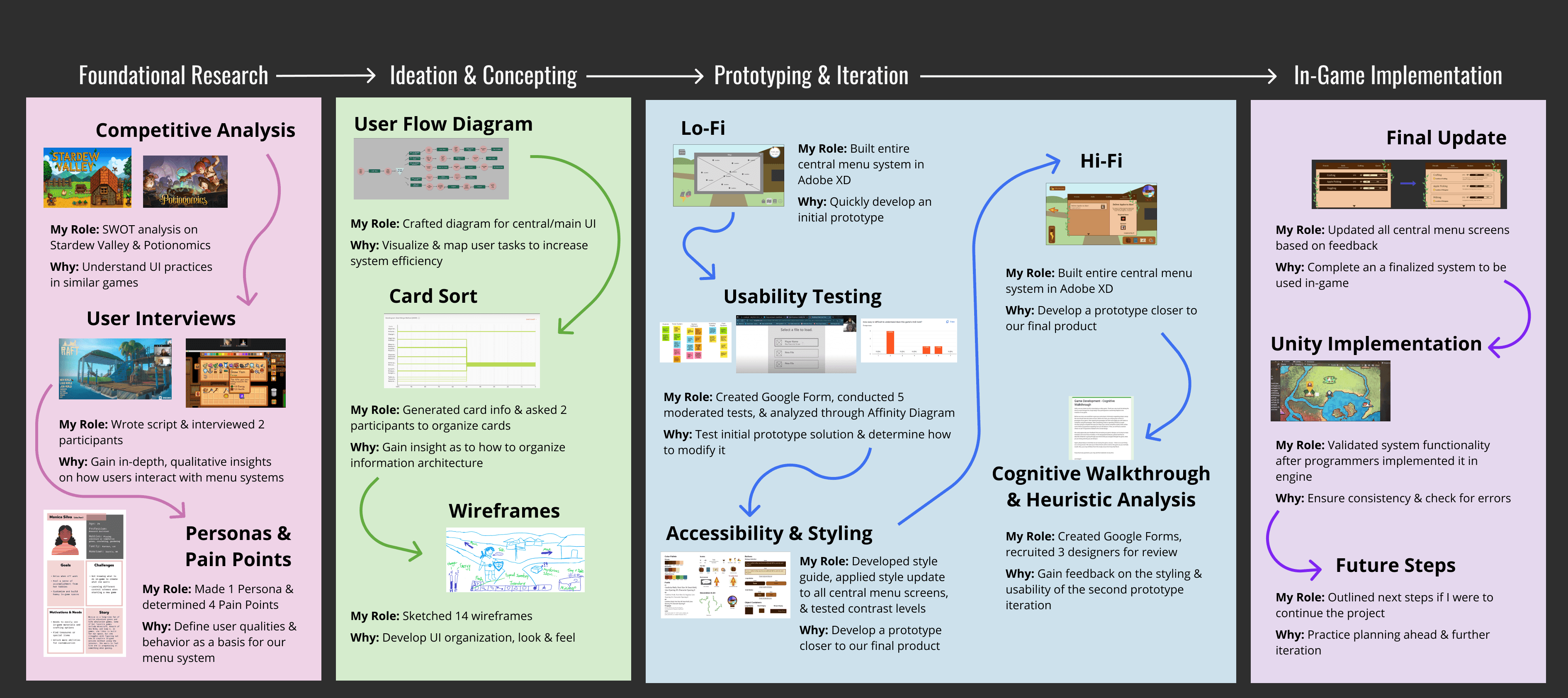
Project Timeline
About the Game
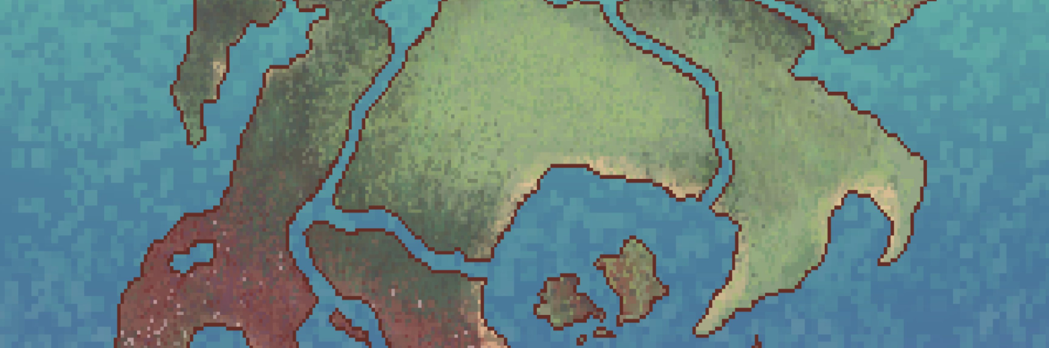
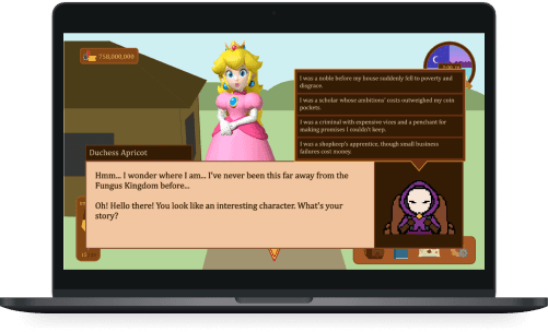
The Kingdom of Westlewood is a thriving nation, serving as the world’s center for trade and commerce. But, ever since the Scourge appeared, the kingdom has been plagued by deadly monsters. The people’s hope rests in a savior courageous enough to take on the Scourge, driven enough to see it through, and adventurous enough to overshadow any and all doubts that may fall in their path. And you…
Are not that savior.
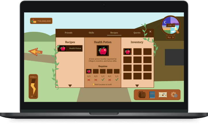
Instead, you are a simple shopkeeper, looking to make as much money as you can to expand your shop and pay off your debts. Play mini games to accumulate materials, craft different magical items, including potions and weaponry, haggle with customers to gain more money, grow your shop, and encounter a colorful cast of characters along the way.
Competitive Analysis
What?
We reviewed similar content to understand life simulator standards, along with the strengths & weaknesses of the design of popular RPGs.
Why?
It allows us to understand the standard of crafting and time management RPGs. We can fix or avoid weaknesses found amongst competitors and build upon their strengths when developing our own product.
How:
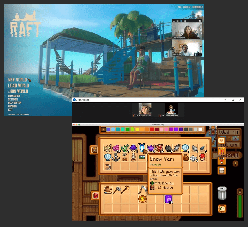
Each team member reviewed two games that were life simulators, crafting, and/or time management games. Each analysis includes: a brief summary, target audience, gameplay/game loop, strengths, weaknesses, player reviews, gaps in the design & how we can take advantage of them. I analyzed Stardew Valley and Potionomics.
Main Takeaways:
Players should be able to easily switch between tools/inventory items
Detailed inventory and crafting menus should be available for viewing
Players should be given subtle hints on what to do, and have further guidance available when crafting
Players should be able to respond during character interactions
User Interviews
What?
Users are asked about their background with video games, their experiences with specific interfaces, and to demonstrate how they go about managing tasks in familiar games.
Why?
It allows us to understand who we are designing for and how this type of gamer approaches and manages tasks within time-management and crafting games.
How:
I conducted two semi-structured interviews with two gamers representing our target users: gamers playing RPGs focused on time-management and/or crafting. One user was selected based on their experience with multiple game genres, and the other user was selected as they only played life-simulation games.
Responses were analyzed by identifying what participants stressed during conversation along with points both participants touched on.
Main UI Takeaways:
Players enjoy crafting systems for their flexibility and variety
Players like discovering new in-game locations or gameplay mechanics
Repetitive gameplay to gather materials is commonplace but can get tiring
Subtle indications or having recipes for crafting are much appreciated
UI and menu systems should be minimalistic
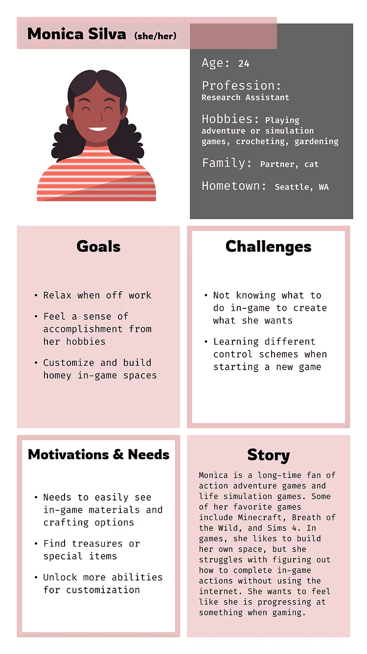
Defining the User
After conducting research on our target users and similar games, we could define the users with a persona and user pain points. We could then come up with solutions to these pain points.
Pain Points
Overwhelming Info: Players of all experience levels (especially casual gamers) can feel overwhelmed by too much on-screen information.
Lack of Guidance: Players often feel lost or unsure of what to do, complaining they must often consult internet sources or friends.
Solutions
Overwhelming Info: Minimalistic interface with options to expand for more information. Utilize visual symbols and indicators to suggest functionality.
Lack of Guidance: Prompt menu exploration through large, colorful icons. Include detailed descriptions of features that are easy to access.
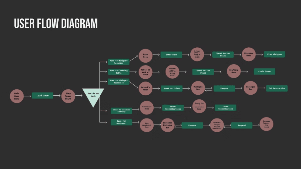
Main Game User Flow
After determining a design direction from the user research, I decided to better visualize what the gameplay would look like by creating a user flow diagram. Next, I wanted to better learn how users would process in-game information.
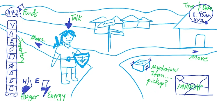
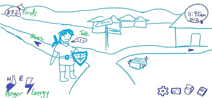
Wireframe Sketches
After determining a user flow along with how we should structure our menu system, each team member created rough sketches demonstrating a look for the UI. Here are some of mine:
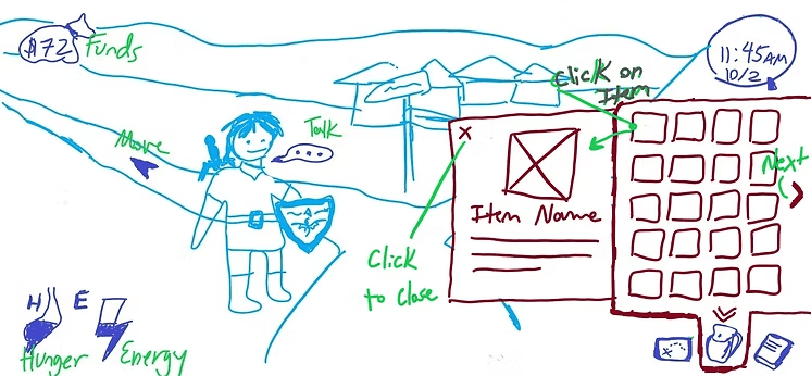
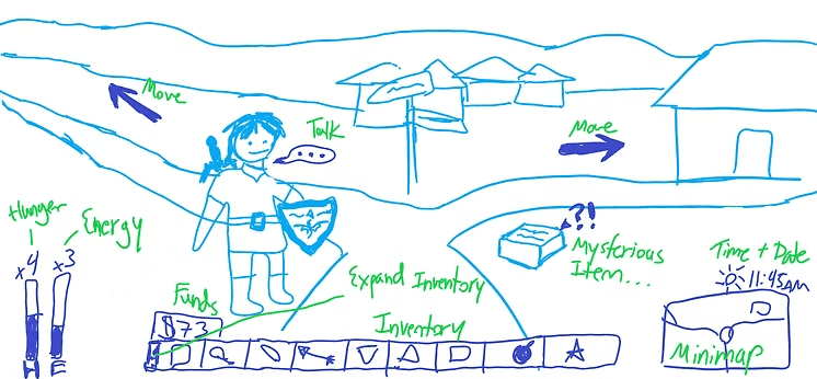
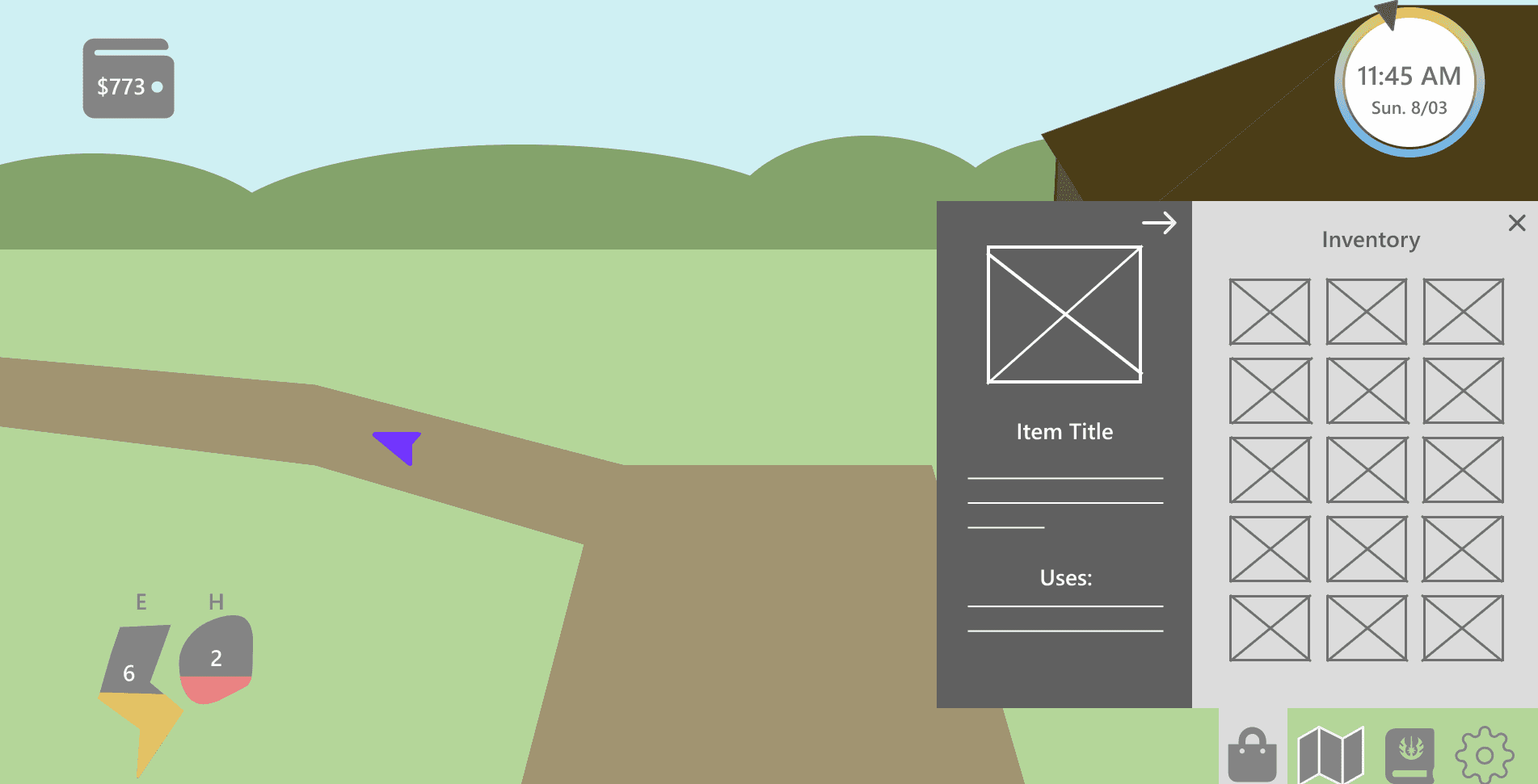
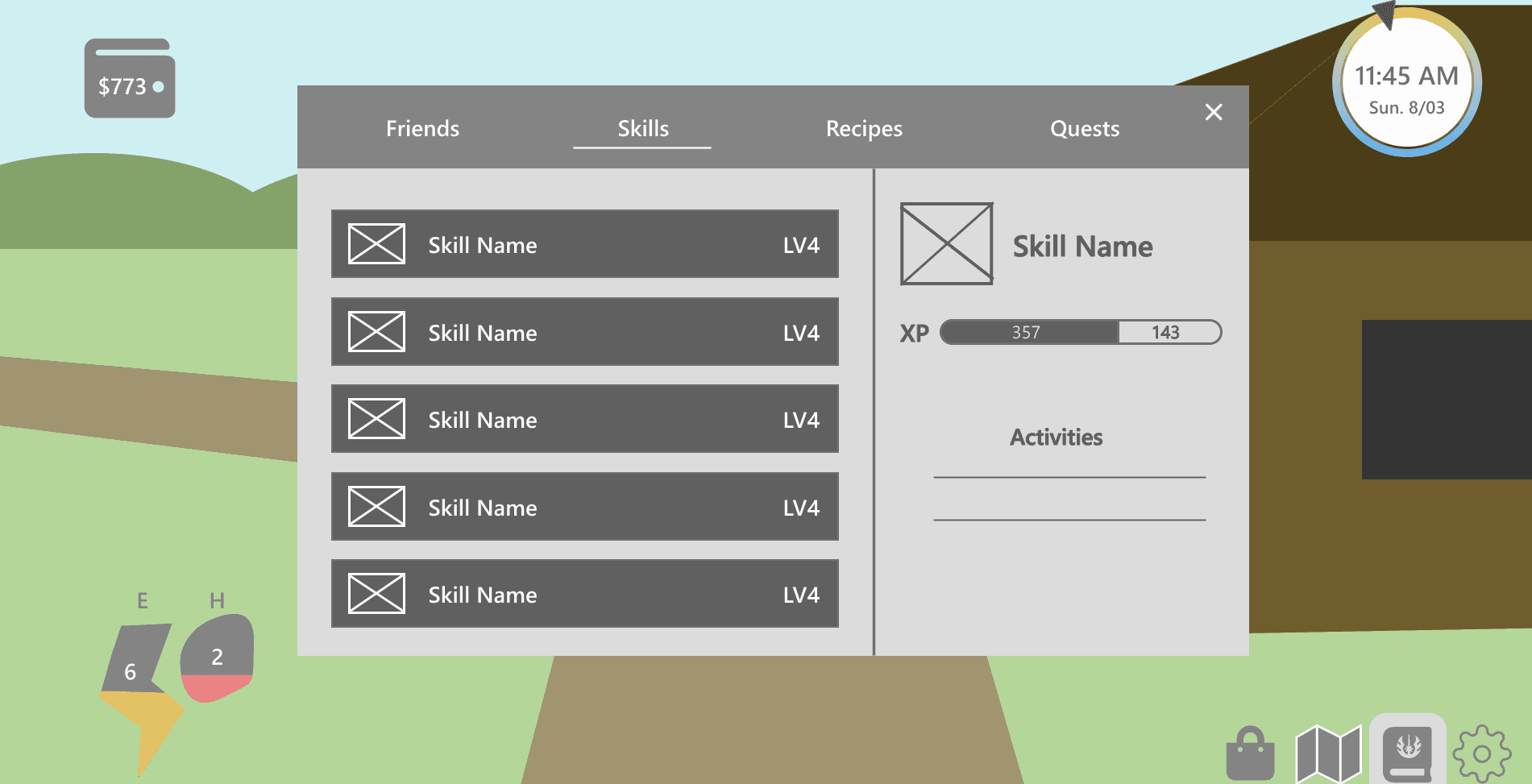
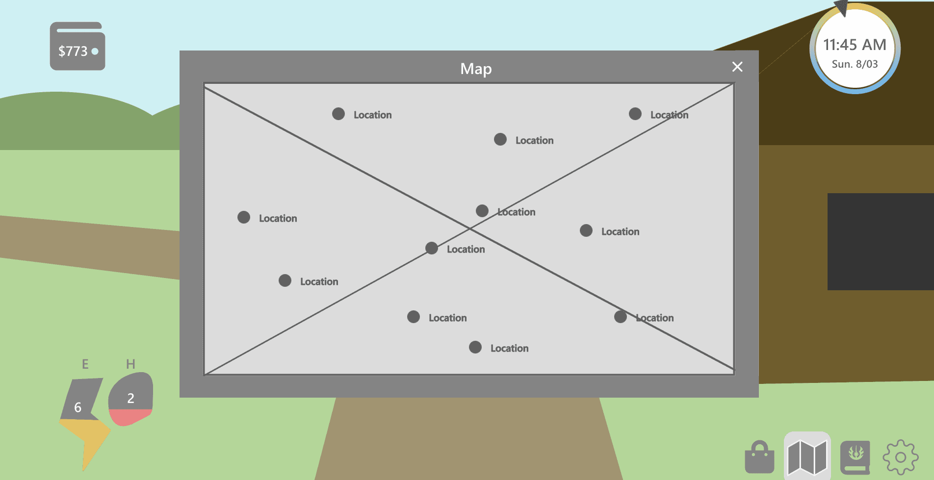
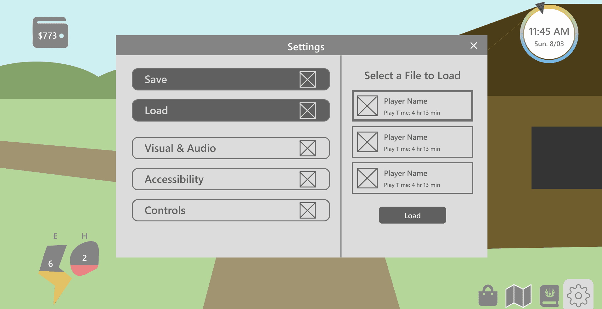
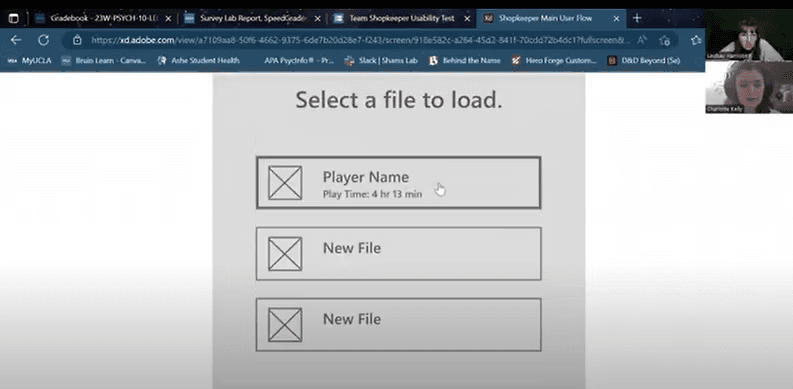
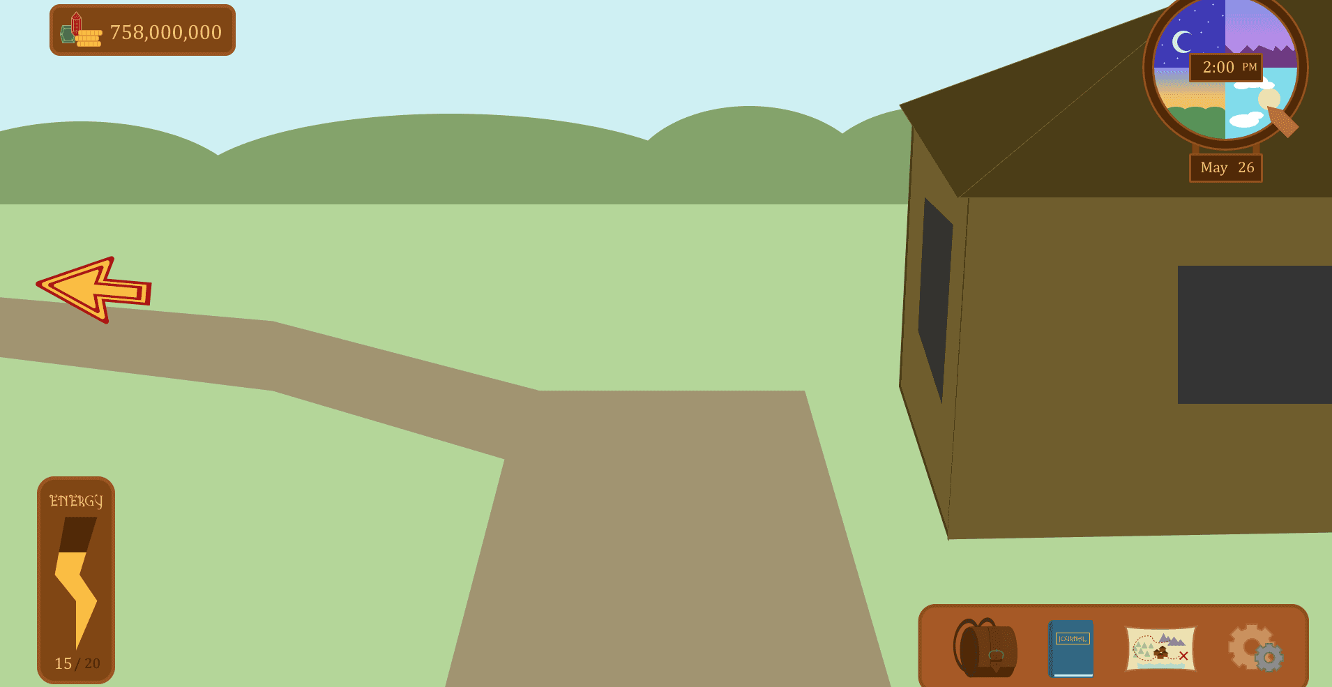
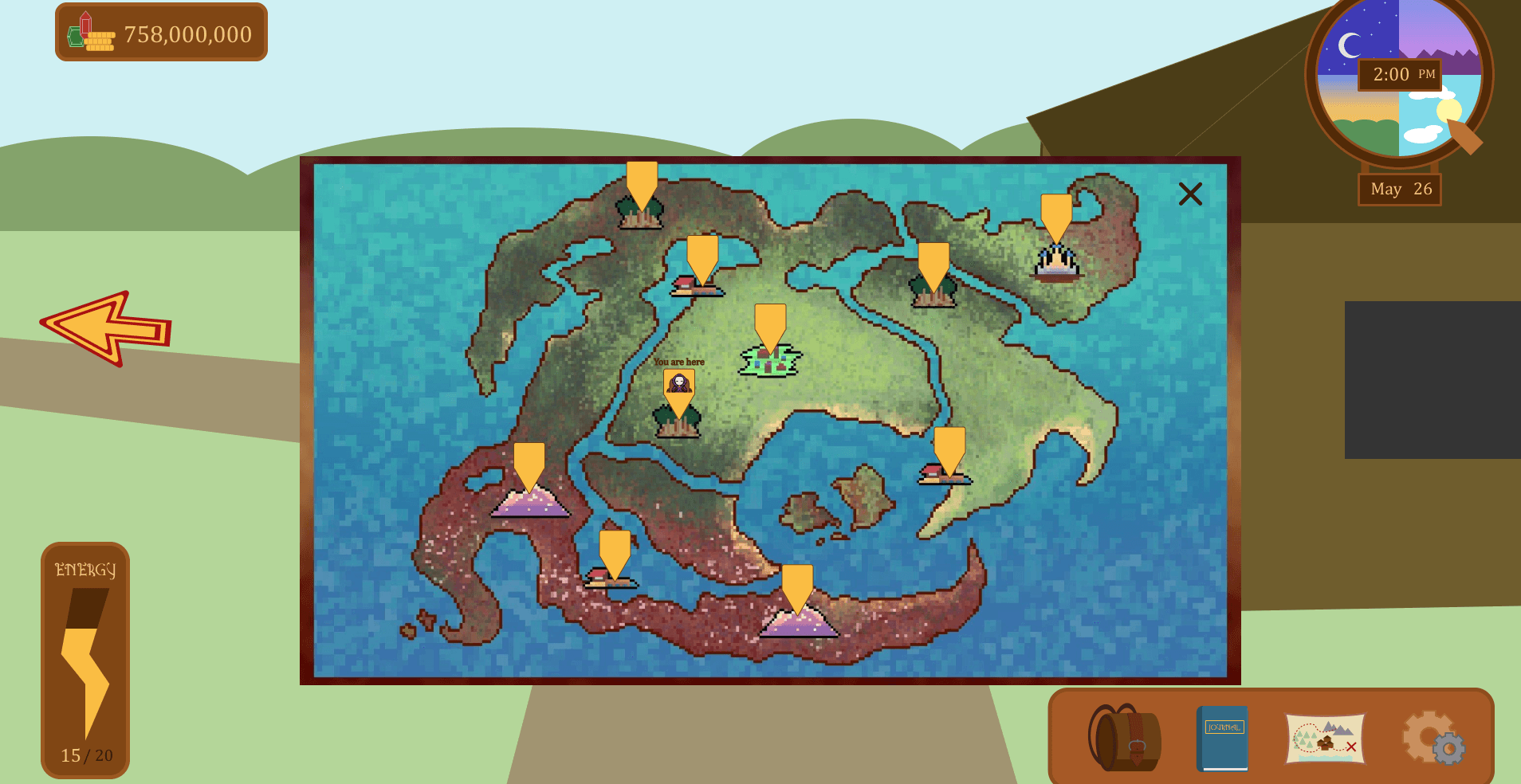
Low Fidelity Prototype
After I had an idea as to how I wanted to design the interface, I created a rough prototype of what players would see in-game, shown below. Next, I would look at how players interacted with the prototype.
Usability Testing
What?
Users attempt to complete tasks within the interface, testing the interface's ease of use along with how well icons and actions match user expectations.
Why?
It helps us to discover weaknesses in the design, so that we may adjust the design and future iterations have higher usability.
How:
I decided to conduct a moderated usability test with five gamers familiar with RPGs & time-management games.
Responses were analyzed using an affinity diagram to group significant input based on topic. Each participant is represented by a different colored sticky note. Survey data was analyzed by calculating averages, SUS scores, and inputting selected adjectives into Voyant.
Main Takeaways:
Task Completion: 100%
The following changes should be implemented:
Navigation buttons need to be clearer.
Symbol purpose should be more obvious.
Inventory display needs updating.
Energy, Hunger, and clock displays should better reflect their purpose.
Participants felt the design was similar to game standards.
Affinity Diagram Analysis
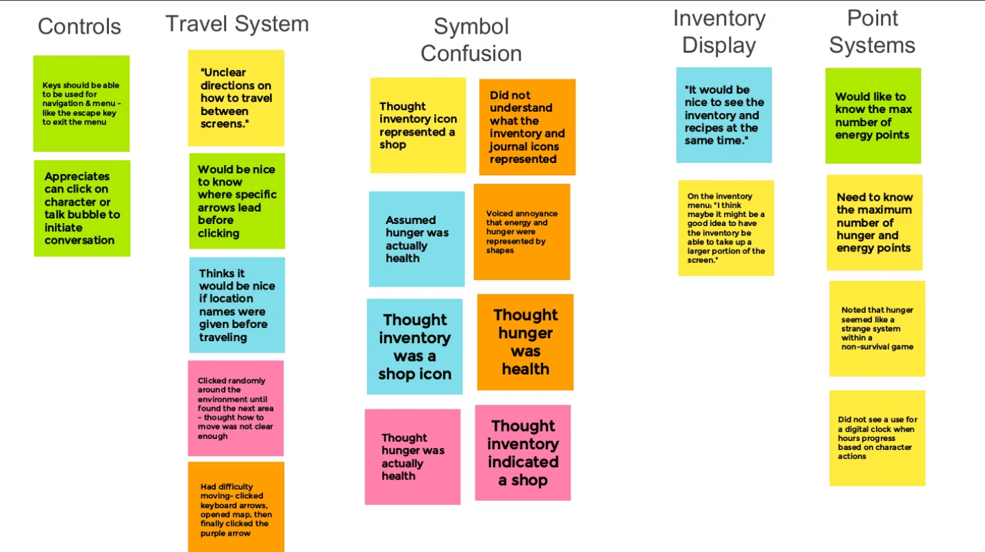
Observed Pain Points & Proposed Solutions
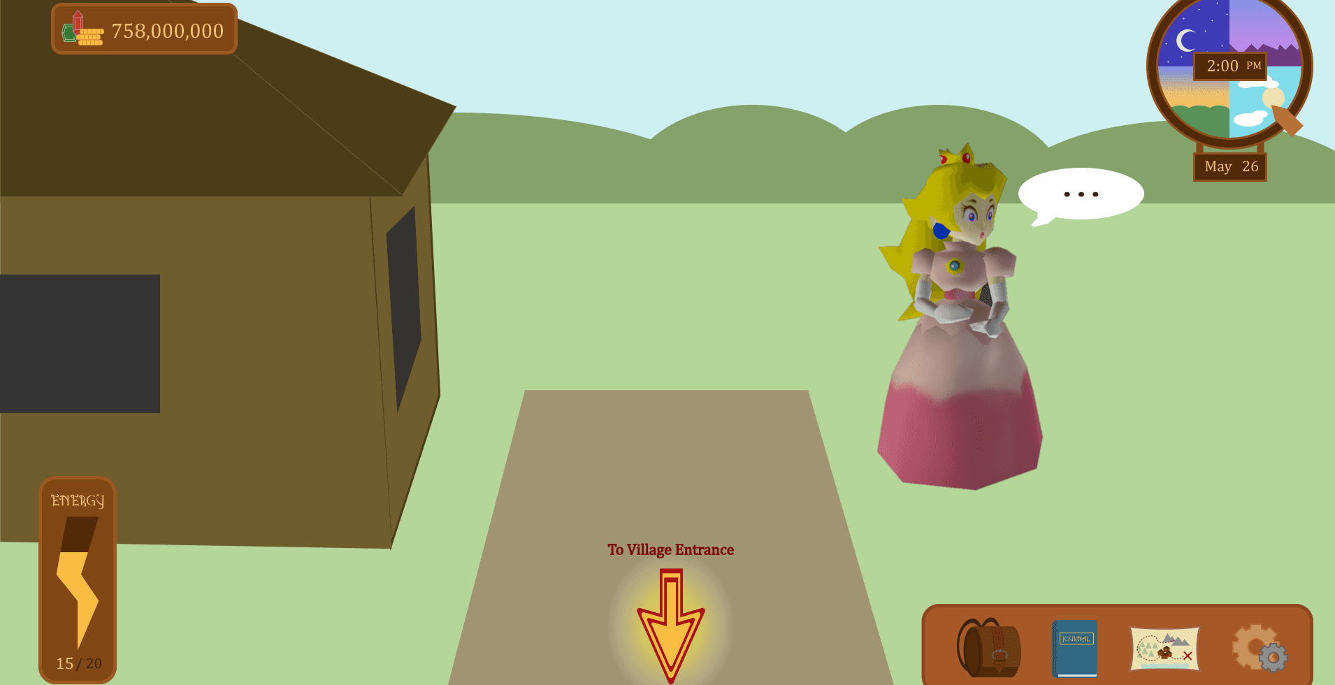
Travel System
Multiple participants felt how to travel was unclear
Multiple participants wanted to know where arrows lead before clicking them
Solution: Include text above arrows, “To Location Name.”
Symbol Confusion
Multiple participants confused the inventory icon with a shop
Multiple participants confused the hunger icon with health
Solution: Replace the inventory icon with a bag and show the names of “Energy” and “Hunger” points on screen.
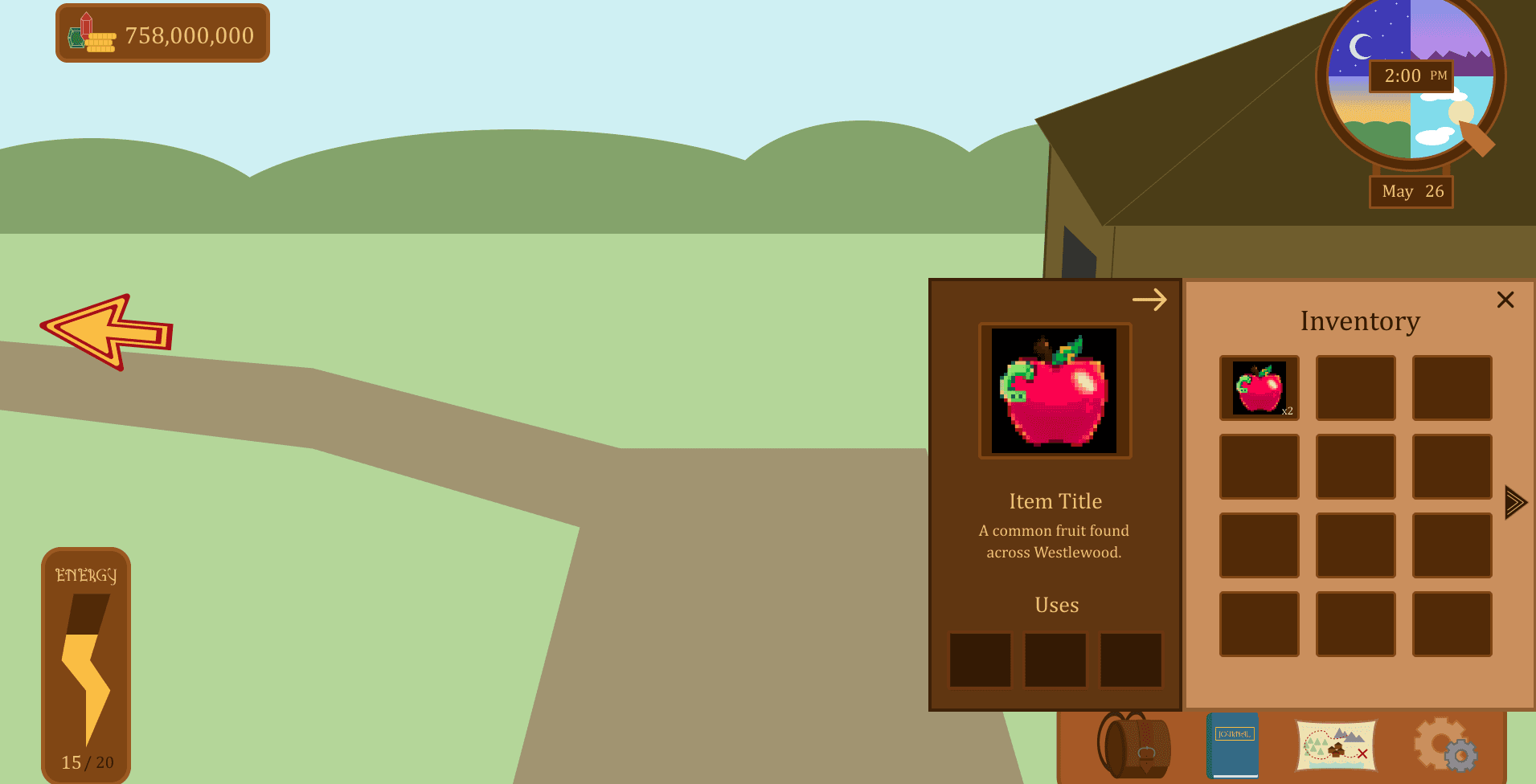
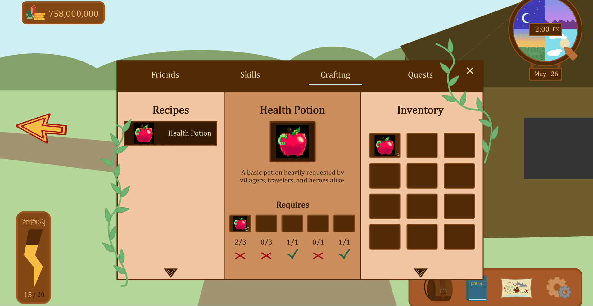
Inventory Display
Participants wanted a larger menu displaying inventory
Participants wanted the recipes next to the inventory for comparison
Solution: On recipe requirements, implement an indicator showing if the player has the item in their inventory. Also, access the inventory within the journal menu system.
Point Systems
Multiple participants wanted to know what the maximum number of energy & health points they had
Participant questioned the necessity of a digital clock
Solution: Display the maximum amount of energy points and implement a more obvious analog clock.
Usability Survey Data
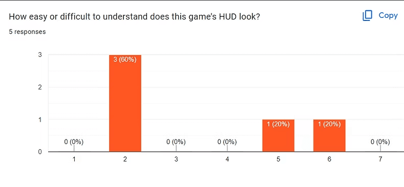
Average HUD Understandability Score: 4
Average System Usability Score: 130.5
The Game's HUD is neither easy nor difficult to interpret. Thus, it could be made easier with clearer indications of what elements represent and more minimalism. System Usability Scores were calculated for each participant on a scale from 0 (unusable) to 150 (easily usable for everyone). With an average score of 130.5, the interface is easy to use but could be more accommodating.
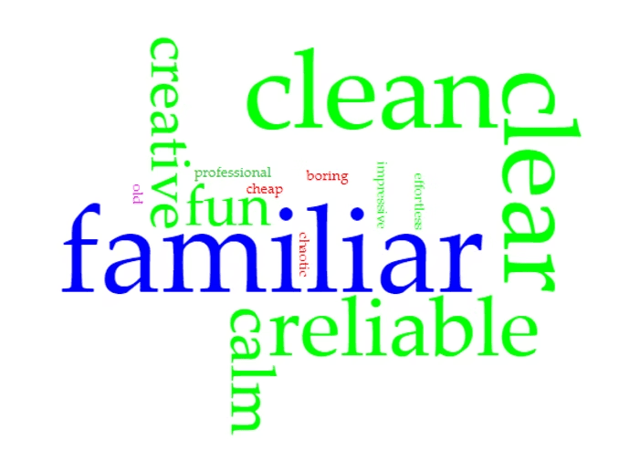
5/5 Participants: "familiar"
4/5 Participants: "clean" , "clear"
3/5 Participants: "reliable"
In the above visualization (created with Voyant), larger words indicate more participants selecting the word, with the maximum as 5 and the minimum as 1. The commonly selected words indicate the current design is easy to understand and follows standards of life-simulator video games.
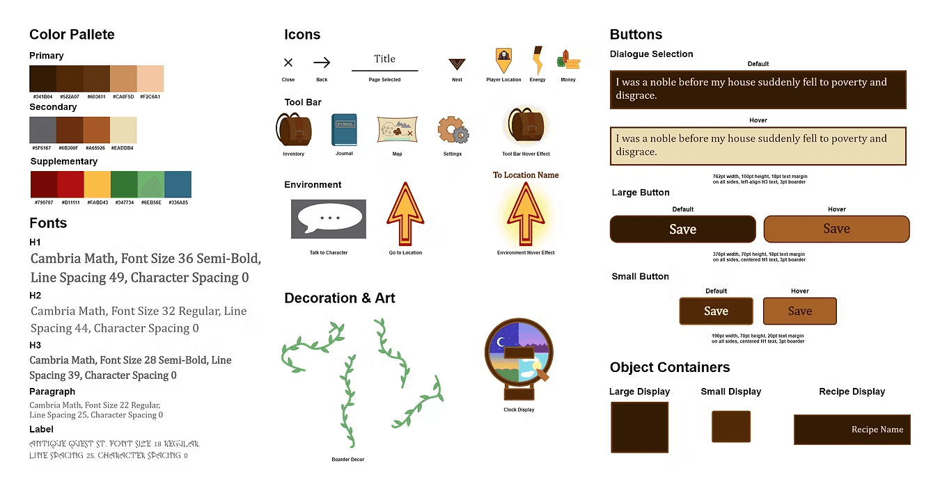
Styling & Accessibility
Once the design problems were identified through usability testing, I implemented changes to the design and created a UI style through use of specific colors, fonts, and graphics.
To verify accessibility, I found the contrast ratio for each font color to each background color. Each display passed the WCAG minimum of a 4.5 : 1 contrast ratio, with the lowest ratio being 4.71 : 1.
Style Guide
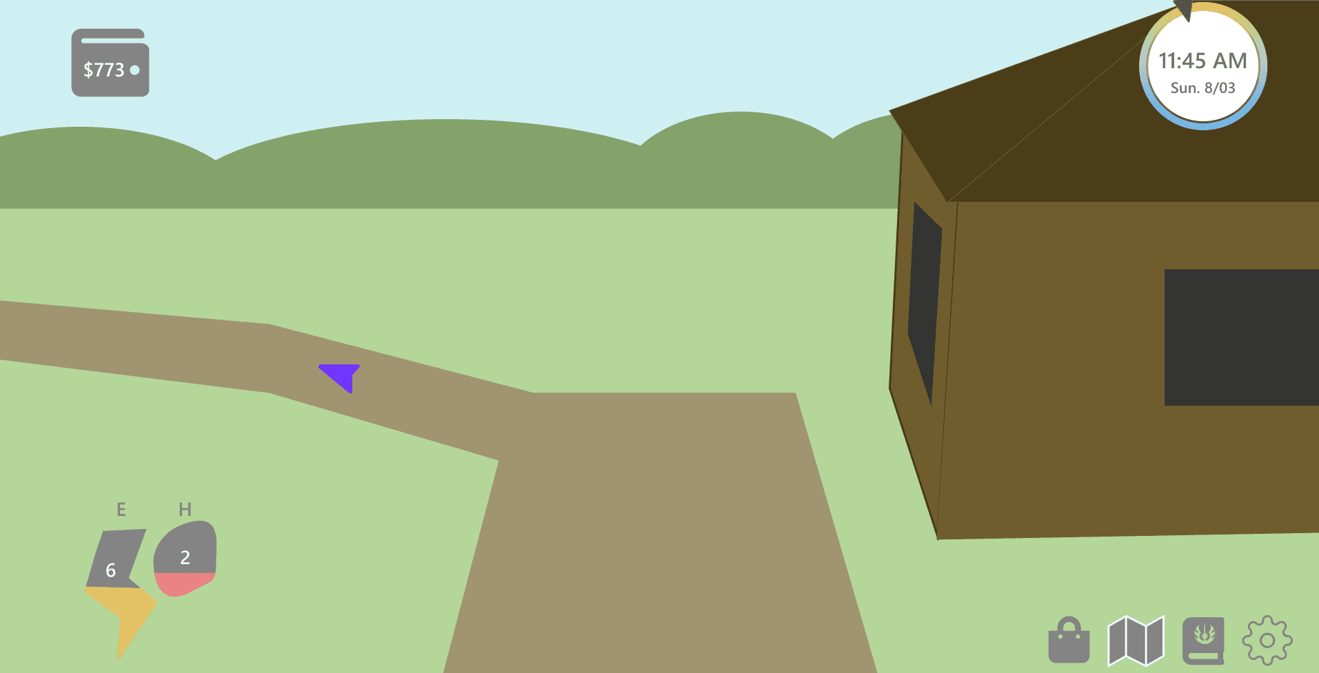
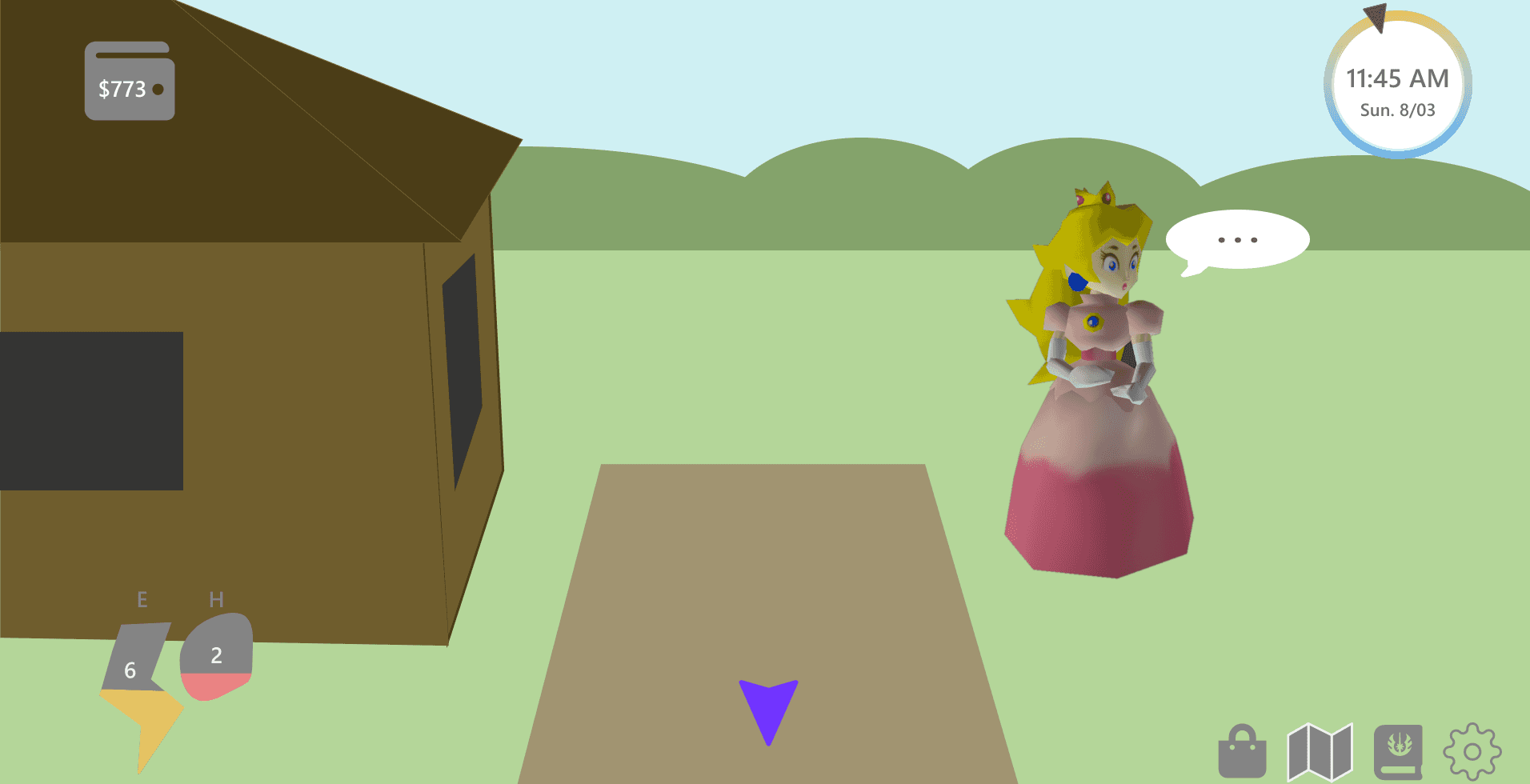
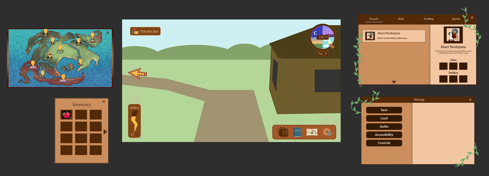
High Fidelity Prototype
After updating the design, I formed connections between screens through simple animations to create a prototype replicating the in-game display.
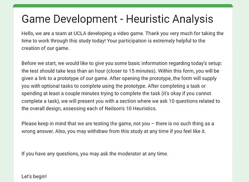
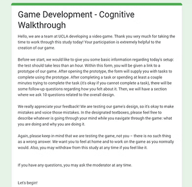
Cognitive Walkthrough
What?
Both evaluate the usability of a design. In a cognitive walkthrough, design experts act as new users and go through tasks in the prototype, providing both design and new user insights. In a heuristic analysis, the participant will review the interface according to how well it follows Nielsen's 10 Usability Heuristics.
Why?
They allows us to identify weaknesses in the design and learn how new users will interact with the interface.
How:
I decided to conduct an unmoderated cognitive walkthrough using two UX designers, and I recruited one UX designer to analyze the interface according to Neilson's 10 Heuristics for system usability. Questions following in-game tasks were integrated in a Google Form users were sent to complete.
Responses were analyzed by reviewing participants' qualitative insights.
Main Takeaways:
Overall, the design is easy to understand and use.
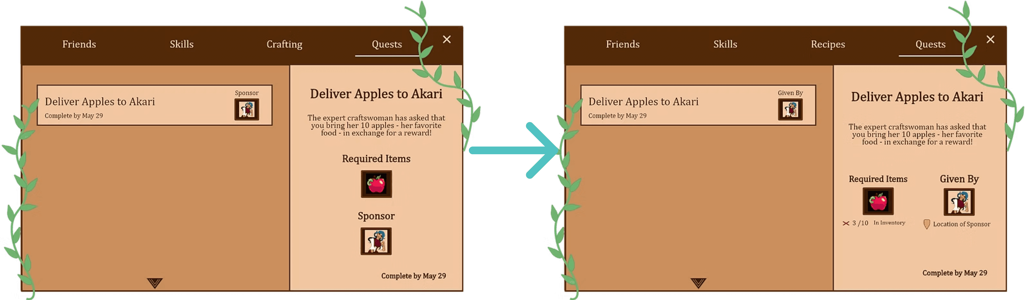
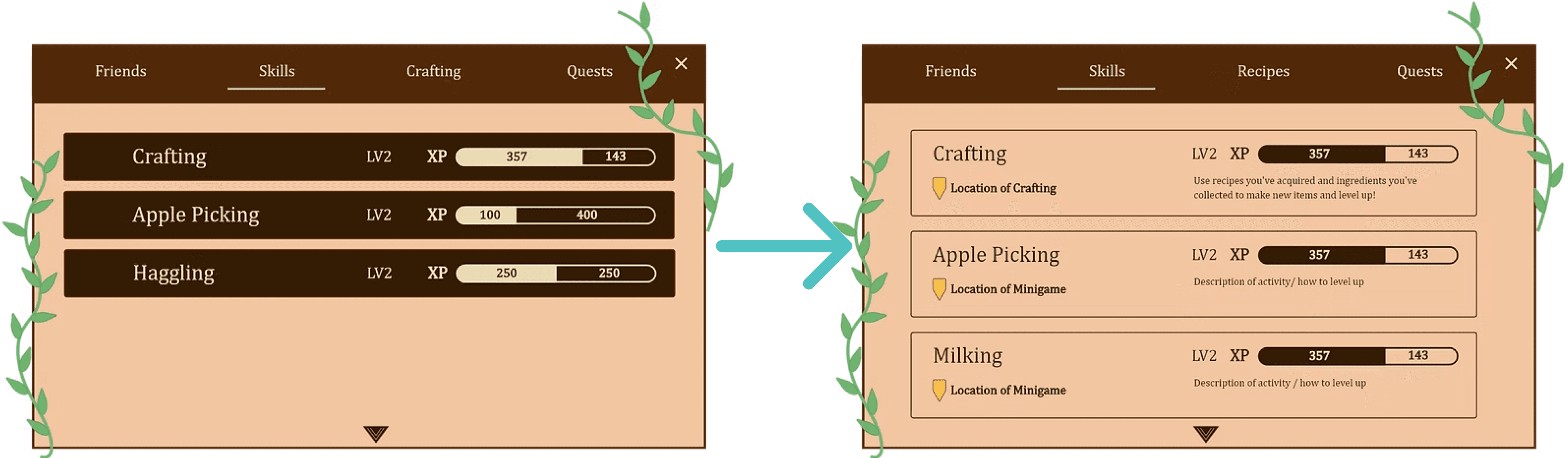
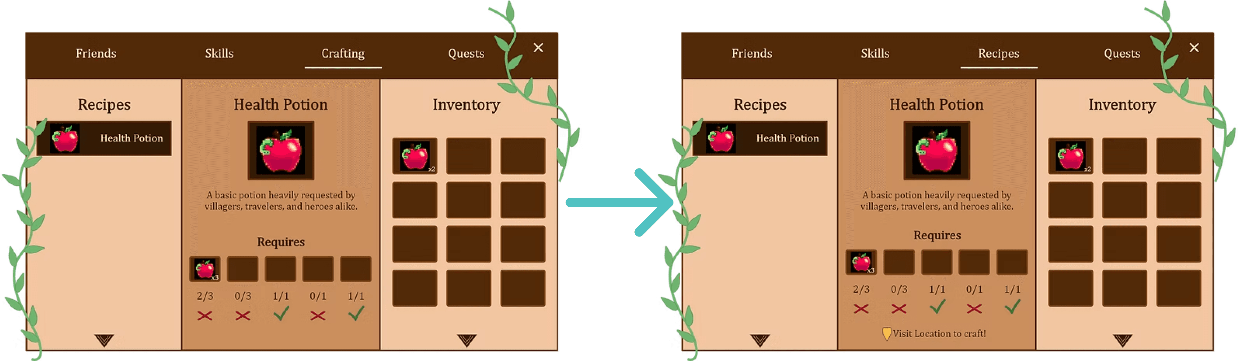
Skills: Add more information on where skills are used and how to upgrade within the Journal UI.
Quests: Use clearer UI language and include more relevant information, like location to complete quest.
Crafting: Change journal "crafting" to journal "recipes" to make it more clear players do not actually craft in this menu. Perhaps add location of where to craft.
Updated Design
From the feedback during the Heuristic Analysis and Cognitive Walkthrough, I changed several menu displays to be more informative. The following changes were made:
Implementing Designs In-Engine
To implement the menu system, I worked with the project's programming team to translate the prototype into Unity. I downloaded each element as an asset, which were used as various menu elements in Unity.
Future Steps
After an initial demo of our game is developed, I would ideally conduct a play test of the game, testing the UI in the context of a rough version of the full game. Once I use these to inform necessary adjustments to the game, we would have a well-tested initial version of the UI. Additionally, after release I would like to conduct a short quantitative survey about player experience within the game.
Art by Joanne Lee
lindsay
HArrison
(C) 2024 by Lindsay Harrison. Created with Figma & Framer.