Improving the SCCWRP’s User Interface
UX Project by Lindsay Harrison
Digital Humanities 110 at UCLA - Fall 2022
About
As part of the Fall 2022 Digital Humanities 110 class at UCLA, I redesigned the website for the Southern California Coastal Water Research Project (SCCWRP) to improve navigation and the overall user experience.
The SCCWRP is an organization responsible for researching topics related to marine waters to help set state guidelines and manage organizations across Southern California. With such a responsibility, their website must cater to a variety of users: environmental scientists, government policy makers, and outside organizations, and the public.
Role: Sole UX Designer Duration: September - December 2022
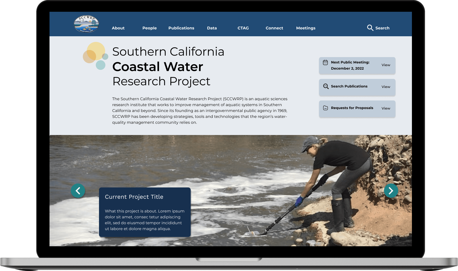
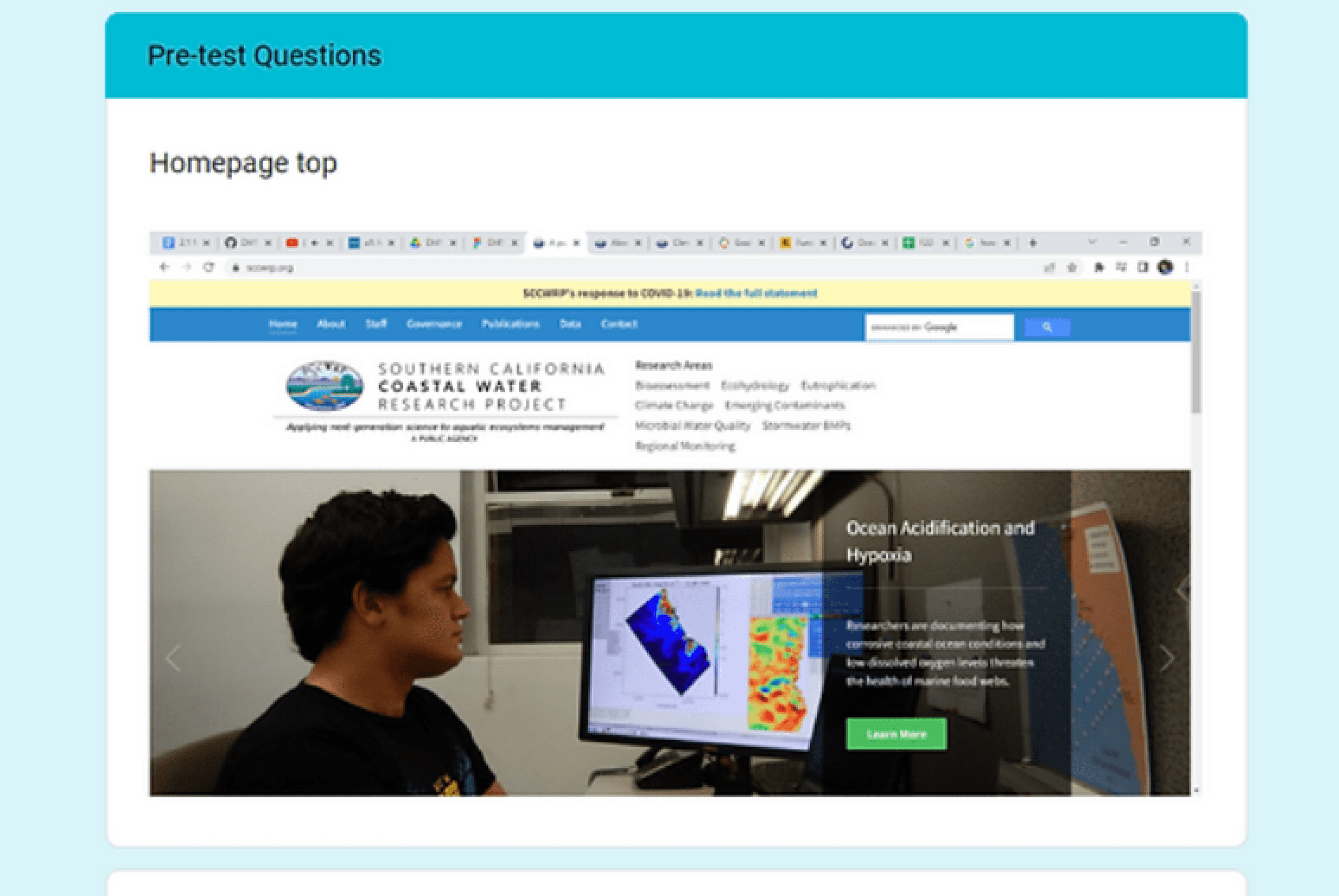
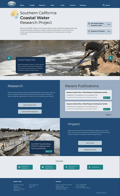
Final Product
Design Problem
For the project, the main issues I considered were:
Difficult general navigation - several relevant pages are somewhat hidden, and the navigation bar appears overwhelming.
Awkward search functionality - buttons do not follow button design conventions, difficult to read article titles, difficult to go back to previous search results.
Cluttered page organization and lack of clarity - many large text paragraphs clumped together, lack of eye-catching elements.
Design Solution
Improving the website’s navigation - they have a variety of content suited to different user needs. Additionally, improving search functionality and page clarity will make finding research easier and the site’s detailed information easier to digest.
Thus, in this project, I set out to create a clearer, more eye-catching page design, a search page that better follows known website conventions, and an improved navigation bar and system.
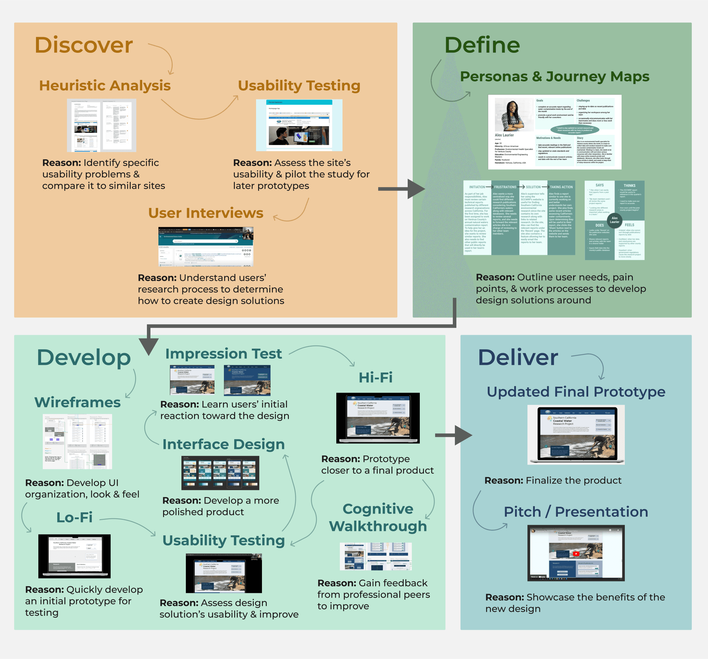
DISCOVER
Learn the current issues & the user needs
The first step into investigating the potential issues with the SCCWRP’s website was to identify its specific design problems and compare it to a similar website. Therefore, I decided to conduct a heuristic analysis to accomplish these tasks. I also piloted a usability test to further investigate these issues and to verify the test’s quality and effectiveness for later prototype usability testing.
HEURISTIC EVALUATION
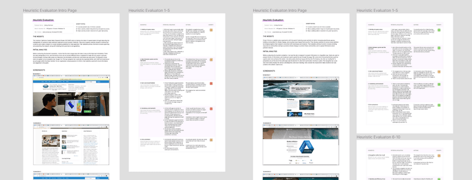
To identify potential design flaws, I conducted a heuristic evaluation where I analyzed the SCCWRP’s website according to how well it followed Nielson’s 10 Heuristics for System Usability, ranking each heuristic on a scale from 1 (minor cosmetic issue) to 3 (major issue). I then performed the same analysis on a similar website - Ocean Visions, an organization connecting companies with current environmental research on a larger scale.
Findings
Of the two websites, the SCCWRP had more major usability issues. The SCCWRP had six heuristics with usability issues ranked 2 and the following two heuristics with rank 3:
User control and freedom - Navigation bar is cluttered and publications search is error-prone.
Consistency and standards - Similar pages do not follow the same layout and there is repeated content.
This analysis helped me to identify possible design solutions to the SCCWRP website’s issues, but before I could begin implementing these solutions, I would need to have actual users confirm these design problems.
USABILITY TESTING
Following my heuristic analysis, I piloted a usability test featuring four tasks SCCWRP users were likely to engage in. This pilot usability test would help me to not only confirm issues found in the heuristic analysis, but to explore other potential issues as well.
I had one user with no background in environmental research pilot the study, so I could understand general usability issues. The four tasks implemented in the usability test included:
Use search functionality to search for a research article.
Navigate to a relevant database.
Find information on public meetings.
Find a researcher’s contact information.
Findings
I noticed the participant struggled to find much of the information asked of them (they investigated many pages and options before finding the correct one). They were unable to complete all steps of Task 1 and Task 3.
USER INTERVIEW
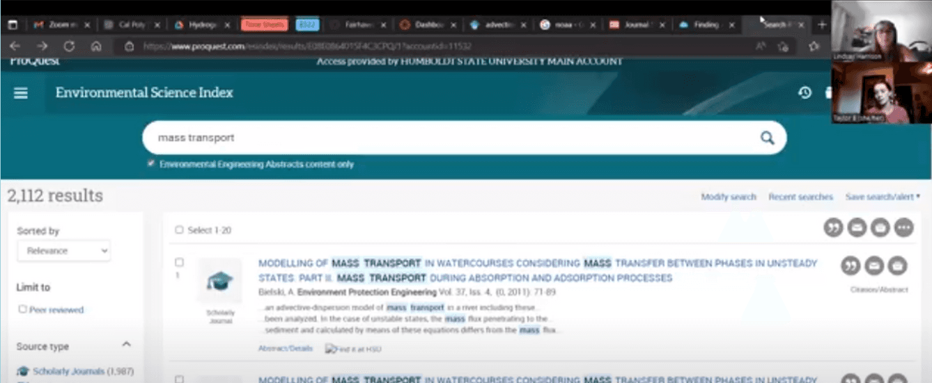
Once the design problems were identified, I set out to find a potential solution. To begin this process, I needed to better understand the website’s users. Specifically, I was interested in how environmental scientists searched for and gathered relevant research, along with investigating the features of websites they often used. Thus, I conducted a semi-structured in-depth user interview.
Participant
An aspiring environmental engineer who had interned at a public research organization and is earning a degree focusing on hydrology and hydraulics at Humboldt State University.

Findings
The process of searching for research is time-consuming and involves reviewing numerous details about an article.
Researchers often keep a working list of potential research to use based on the article’s abstract.
The participant also indicated research websites featuring many subtopics can easily feel overwhelming, so they usually use a general search functionality.

Interview Content
Background questions - Learning more about the participant's experience with environmental research and their research process.
User activities - Asking the participant to demonstrate her research process by searching for articles and databases they would use and analyzing them.
User satisfaction, feedback & expectations - Asking the user how they feel about their process and the tools available to them, along with what they expect from research tools.

DEFINE
Establish the user groups and specific user problems
The first step into investigating the potential issues with the SCCWRP’s website was to identify its specific design problems and compare it to a similar website. Therefore, I decided to conduct a heuristic analysis to accomplish these tasks. I also piloted a usability test to further investigate these issues and to verify the test’s quality and effectiveness for later prototype usability testing.
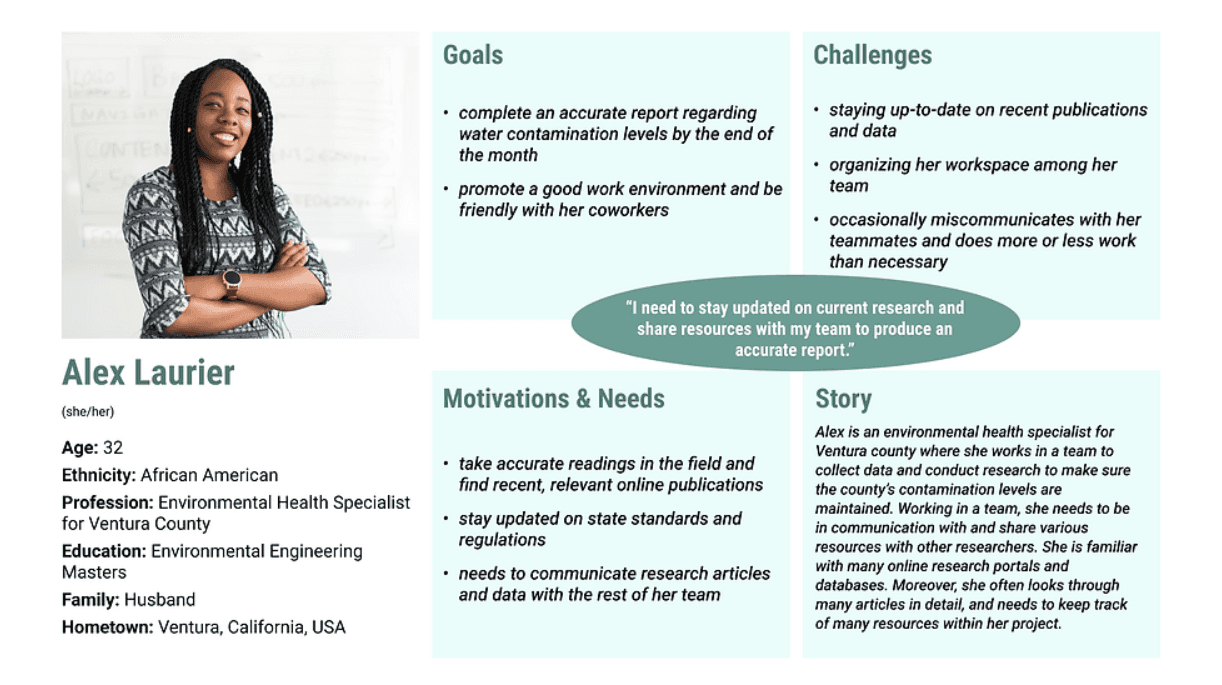
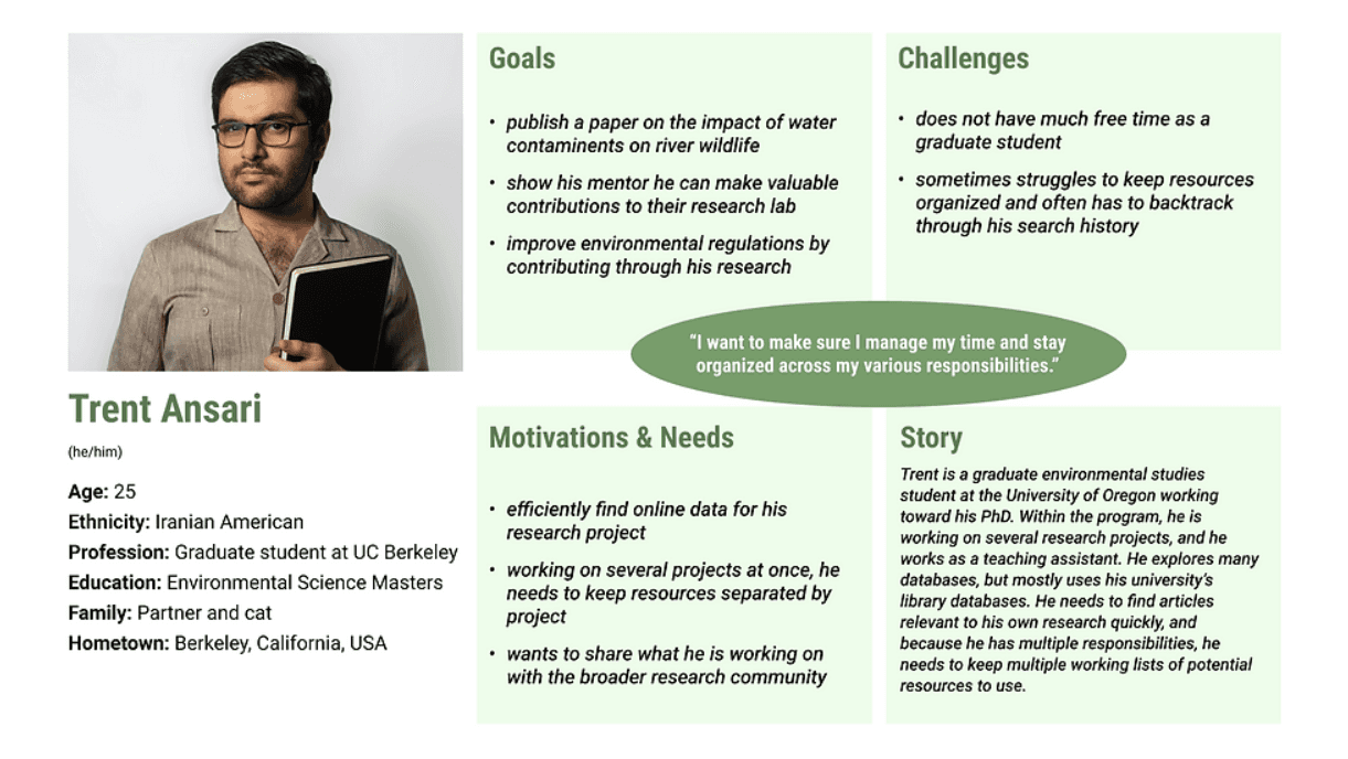
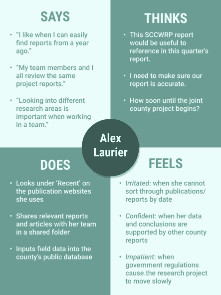
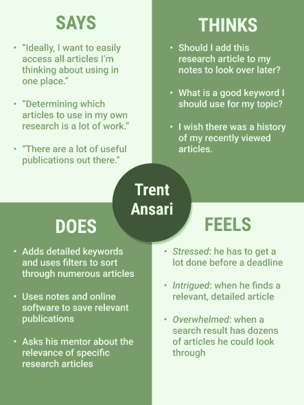
Based on these personas, I created an empathy map along with a user journey map for each. I then wrote a scenario for each persona describing how they would use the SCCWRP’s website, including searching for specific research articles and reviewing a recent report before sharing it with coworkers.
After defining the users through these personas, I felt I understood user needs, so I went ahead and began the design process.
DEVELOP
Create a refined product that responds to user problems
WIREFRAMES & LO-FI PROTOTYPE
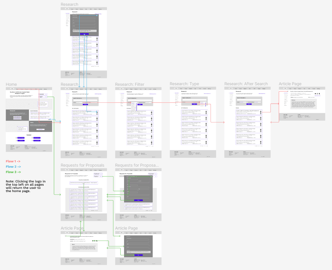
Search for a recent article assessing the sea life in California’s coastal waters (relevant to Trent’s User Scenario) - see Flow 1
Find the most recent technical report and send it to a coworker (relevant to Alex’s User Scenario) - see Flow 2
Determine the presently available Requests for Proposals and submit your contact information to be added to the bidder’s list - see Flow 3
To begin the design process, I defined several central user tasks based on the persona scenarios. I additionally realized users would likely want to review Requests for Proposals (RFPs) on the website (especially outside public agencies relevant to Alex Laurier’s persona), so I decided to include a new task. The three tasks the prototype would focus on were:
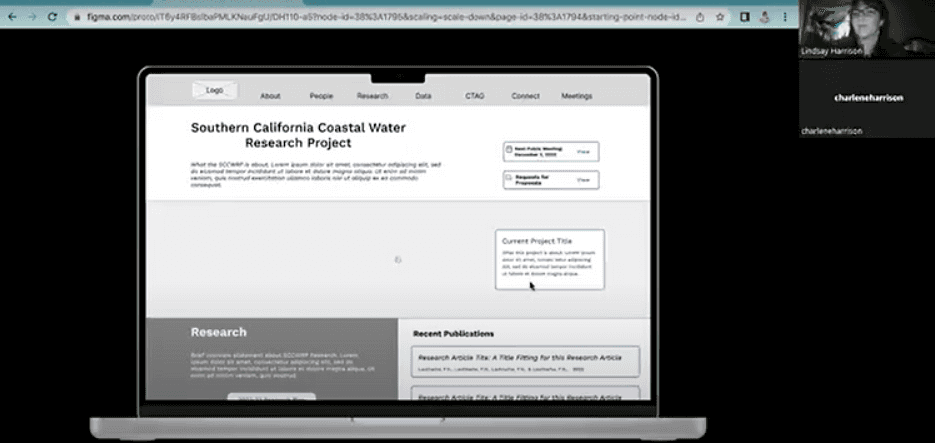
I created a low fidelity prototype in Figma based on the digital wireflow and had one user without environmental research experience walk through the prototype to identify any general pain points.
In a moderated usability test conducted over Zoom, they were instructed to completed each of the three tasks outlined above.

From the usability test, I determined the following user pain points:
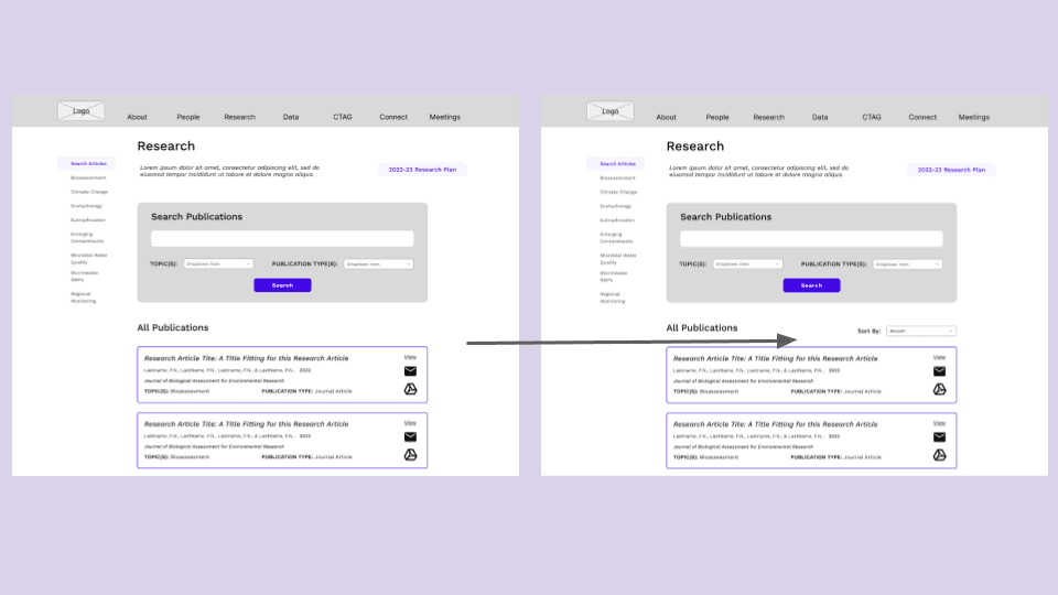
The default display of 'All Publications' on the main research page is confusing - it should be more obvious and adjustable.
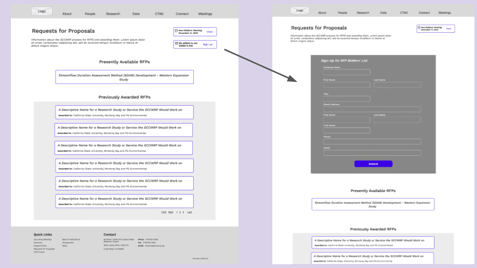
Signing up for the Bidder's List on the RFPs page is unintuitive due to button placement and popup.

Solutions:
Add a 'Sort By' dropdown function at the top where it specifies the default organizes publications from newest to oldest, but it may be changed to other settings.
Embed the email signup within the RFP's page and get rid of the popup. Place it before the list of available RFPs.
Solution 1
Solution 2
INTERFACE DESIGN
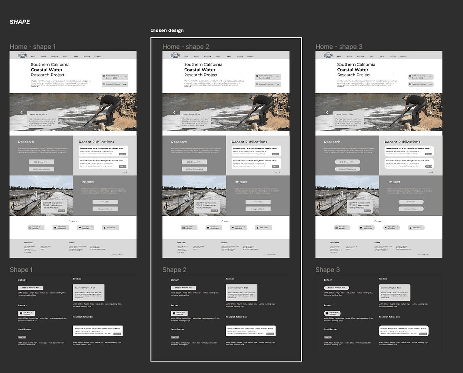
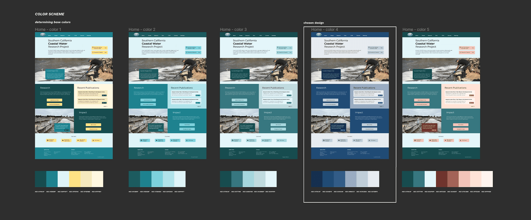
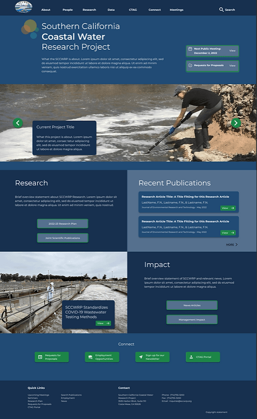
After refining the design, it was time to determine the overall look and feel of the redesigned website. Using my wireframe home page, I completed several design iterations on the website’s layout, font family, color scheme, along with button and callout shapes. I decided on a final style for both a light mode and dark mode, and I ensured all color contrast pairings passed at a WCAG AA level.
Impression Test
I conducted an impression test on the redesigned homepage over Zoom. I showed the participant the design for 5 seconds. I then asked questions regarding how they perceived the look and feel of the website, along with what they though the site's purpose was.
The participant described my design as clear and professional, and they understood it related to water research. Thus, I decided my interface was suitable to move forward with.
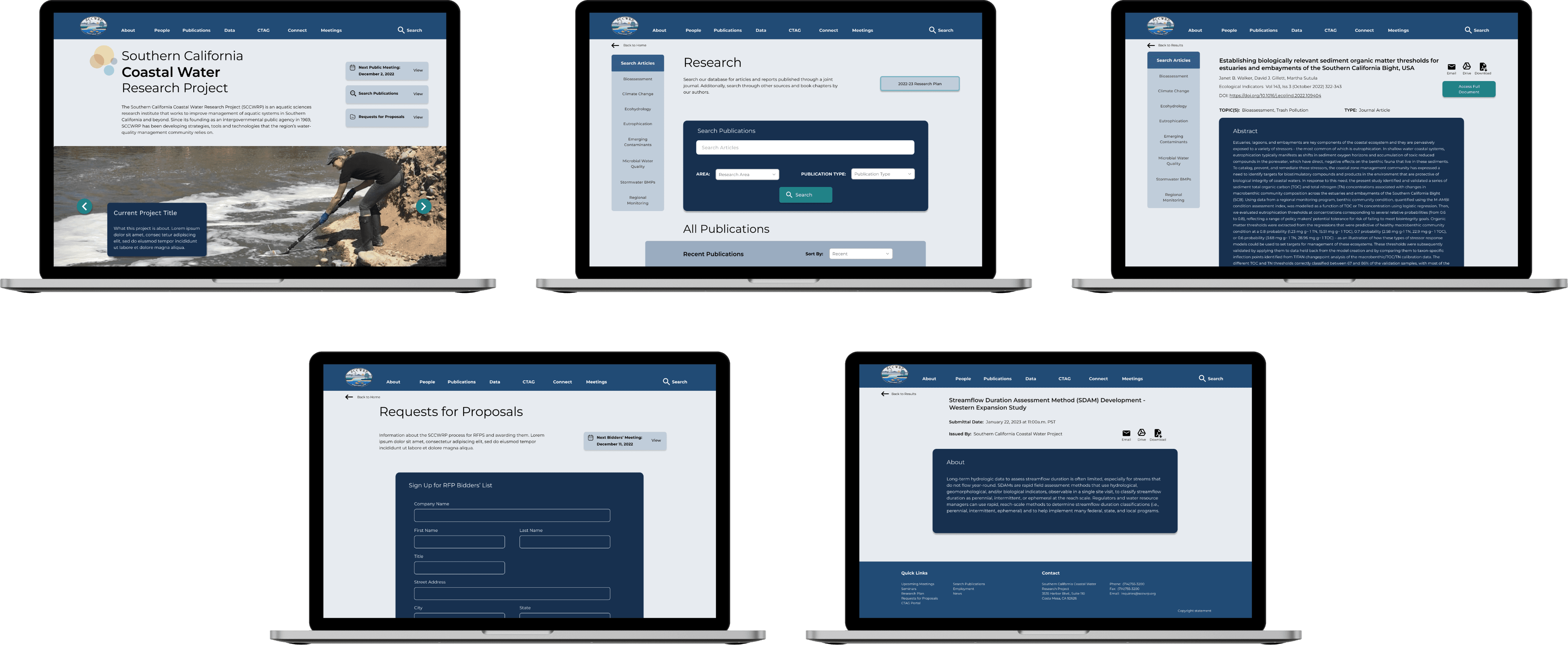
MOCKUPS & HI-FI PROTOTYPE
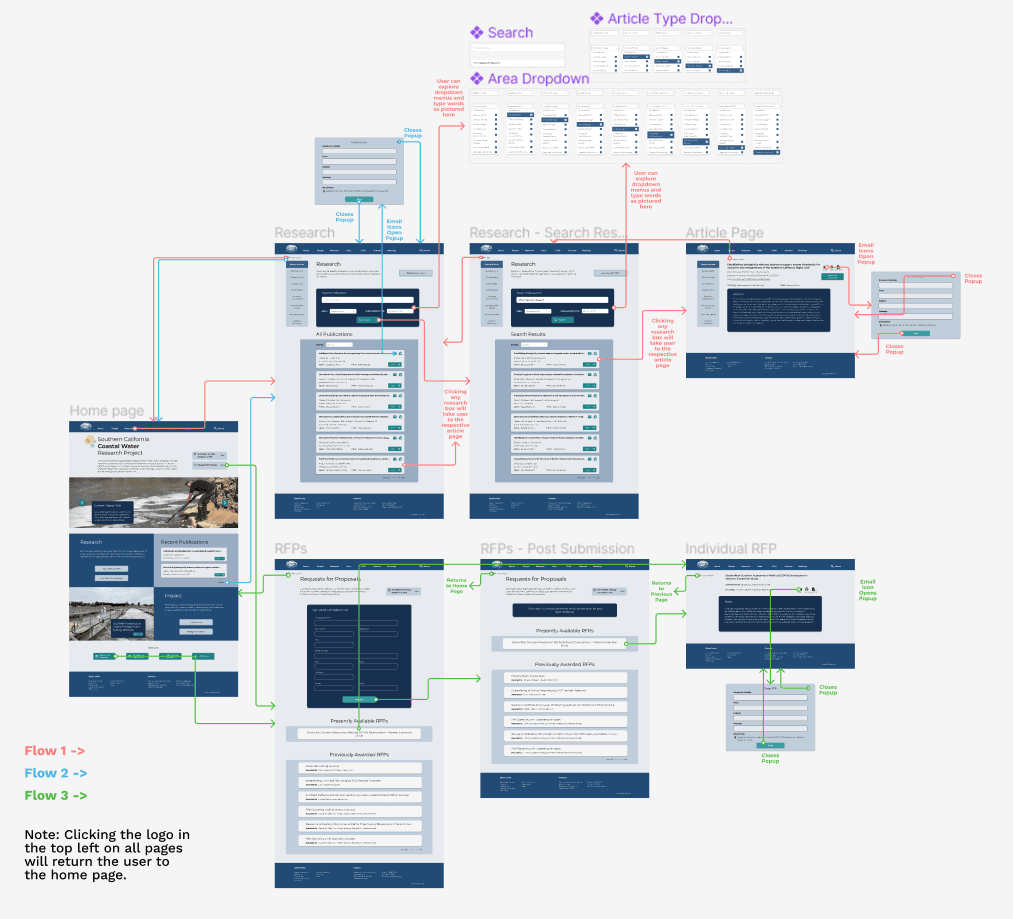
Based on the low fidelity prototype and interface redesign, I implemented the decided graphic styling on each page from the wireframes and created a user flow diagram with the more polished webpages, as seen below.
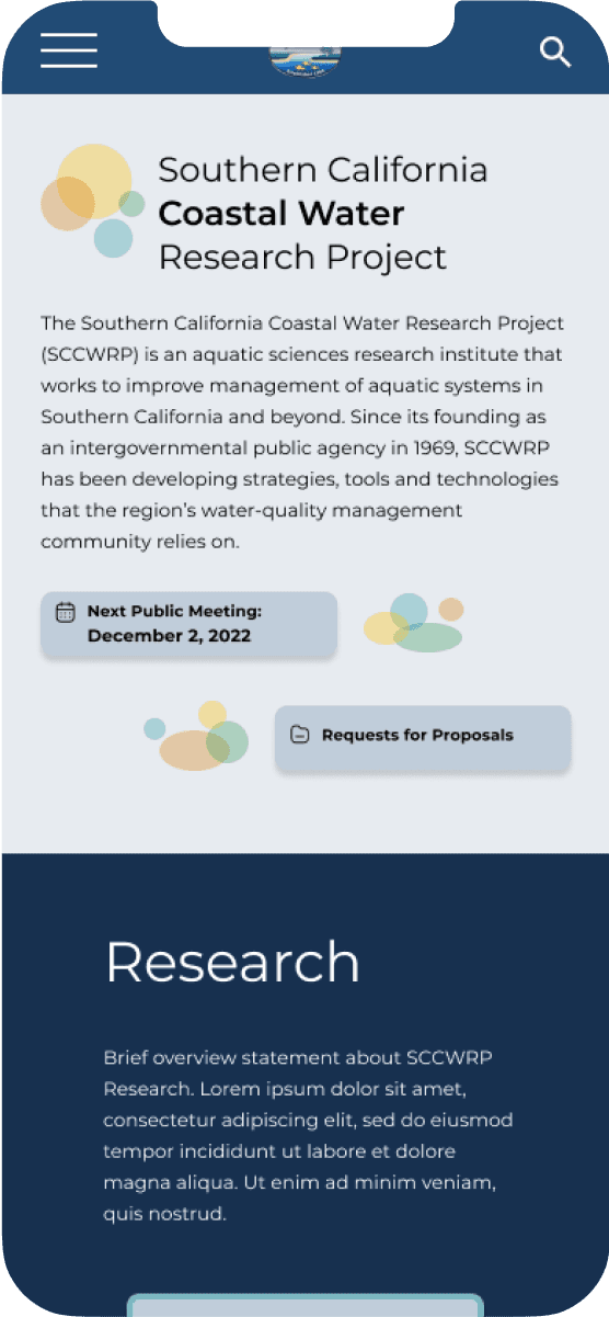
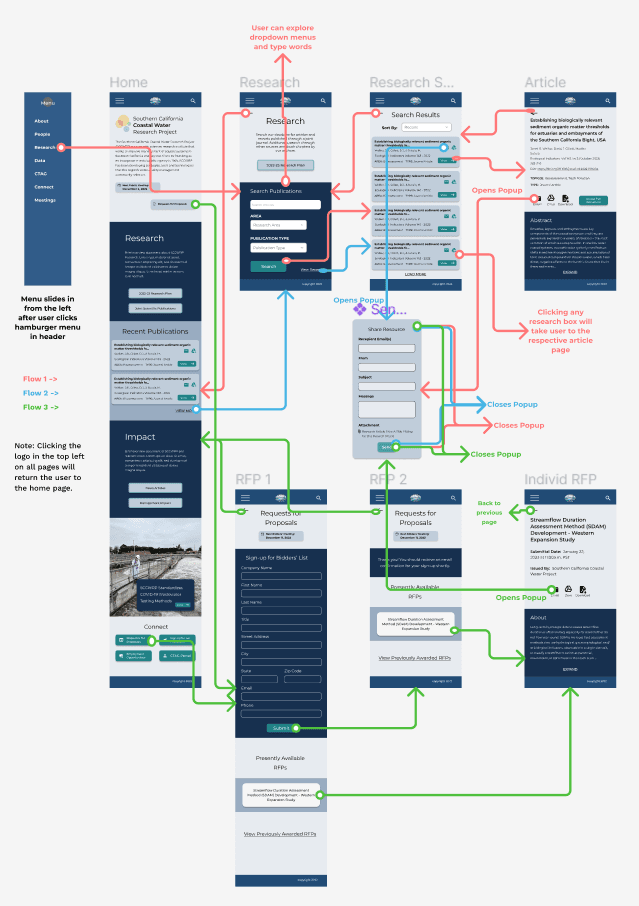
Mobile Design
Because using cell phones to complete tasks is becoming more and more commonplace, I additionally created a graphic interface and user flow for a mobile version of the website, as pictured below. However, as users indicated they would mostly use the SCCWRP on a desktop computer (see user research above), I kept my focus on the website’s desktop version.
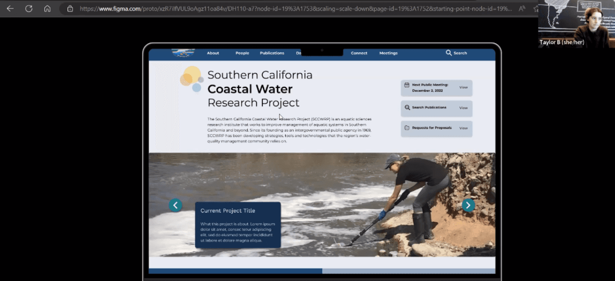
I then created a high fidelity prototype in Figma based on the website version’s updated user flow diagram, complete with animations and button interactivity. Review the high fidelity prototype below:
REDESIGN, EVALUATION & REVISION
Cognitive Walkthrough
As a final step in the research and design process, I evaluated the redesign and determined how to revise it.
Participants
I conducted an in-person, moderated cognitive walkthrough with 2 design experts, fellow UX designers also enrolled in Digital Humanities 110, posing as new users to the interface. They were asked to complete the three tasks within the prototype and describe:
Their overall impression of the design.
How well they understand prototype feedback.
How well they could progress through or understand tasks.
How the user flow may be improved.
Findings
While I did learn the design is overall clean and professional, there were a few adjustments to be made that both users agreed upon:
Touch up dropdown menu navigation: ensure it is functional on all pages and make pages for areas of research more distinguishable from the general research page.
Make the back button more noticeable and consistent on each page.
Add a direct link to research publications at the top of the home page.
Usability Testing
After the cognitive walkthrough, I also conducted two moderated usability tests over Zoom based on the earlier usability test, but with the revised tasks more in line with the three defined when creating the initial prototype. In addition to completing the three tasks and answering questions about the design and their experience, participants took two surveys:
System Usability Scale (7-point, 10 question version)
Production Satisfaction Card Selection (choose 5 adjectives from a list to describe the interface)
Participants
Participant 1: A National Geographic volunteer and writer with a qualitative, less technical approach to research.
+ Completed all tasks.
+ Thought each page was clear and each task was straightforward and streamlined.
- Thought combination of vibrant colored boxes and images could be overwhelming.
- Took more time than expected when searching for recent articles.
Participant 2: An undergraduate environmental engineering student with a highly detailed approach to research.
+ Completed all tasks.
+ Reported using this website felt familiar, similar to their previous experiences.
- Thought some text was too small- specifically with the article abstracts and other article details.
Findings
Task Completion: 100%
Production Satisfaction Card selection: the top words are “calm” and “professional”
System Usability Scale (SUS) Score: 64.17 - Good (see linked documentation for more details).
From identifying the most significant responses and what participants noticed in common, I determined:
Finding recent publications still took too long, so I added a subheading titled “Recent Publications” to the publications search page.
Some text sizes were too small.
Finally, I used what I learned from the cognitive walkthrough and usability tests to make some final adjustments to the redesign. The final design can be seen below:
Final Design
Conclusion
To further the design process for the SCCWRP redesign, I would conduct five usability tests with target users on the updated, final design. I believe this would identify any hidden problems with the design before it would be truly finalized, and the feedback could verify the website as effective and professional.
Overall, the process of researching and designing the SCCWRP’s website was challenging. The SCCWRP’s website serves a variety of purposes, so identifying which pages were the most important for the most users was difficult. Still, I enjoyed the project and did my best to tackle the design problems. My favorite part of this project was determining exact solutions to the individual problems I faced - both in the initial design (e.g., when I was trying to figure out where to put the News Articles page in the navigation bar) and after given feedback (e.g., when a user had difficulty finding recent publications). In contrast, I faced the most difficulty in recruiting participants who were environmental researchers. Thus, in future UX projects, I would put more emphasis on the user research phase. Interviewing more than one participant to help me learn more about the user group would have helped me design some of the tasks better earlier on.
lindsay
HArrison
(C) 2024 by Lindsay Harrison. Created with Figma & Framer.