An interdisciplinary, peer-networking program.
Made for Bruins, by Bruins.

about
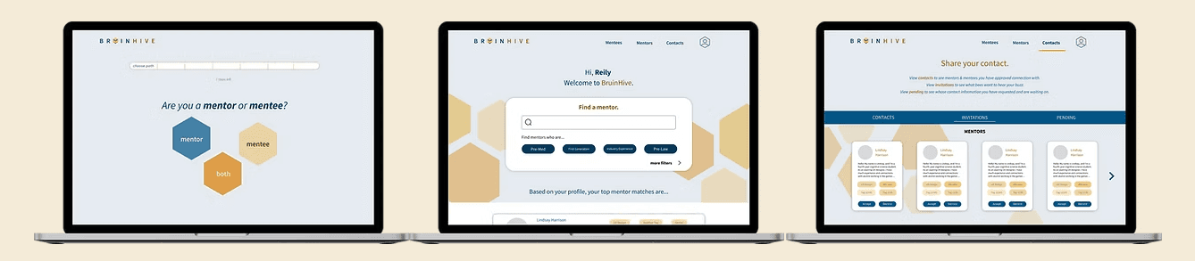
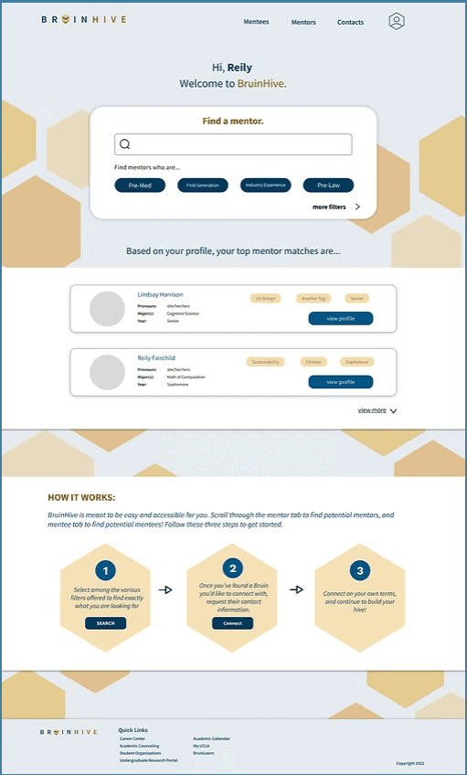
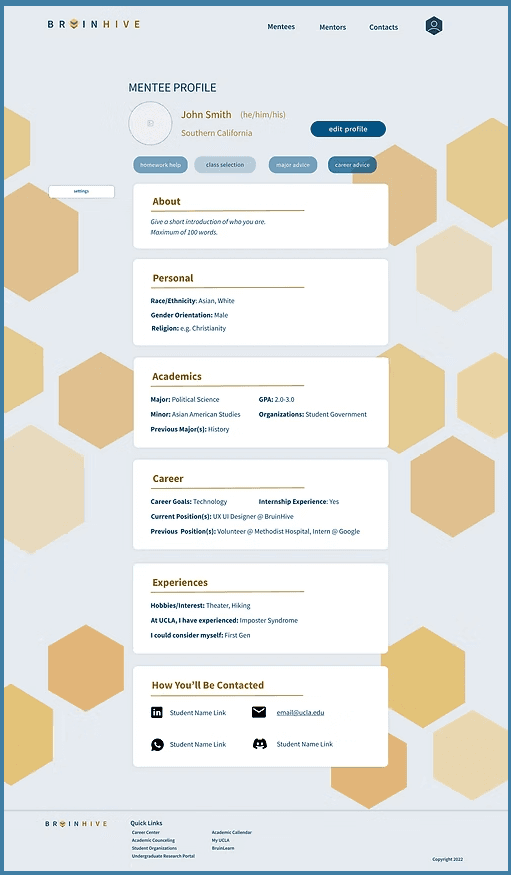
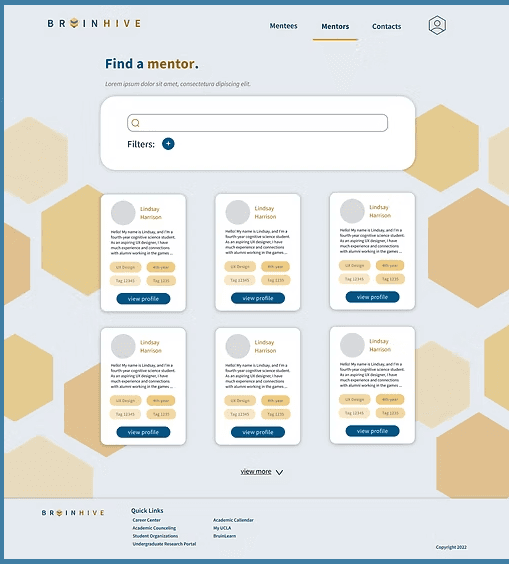
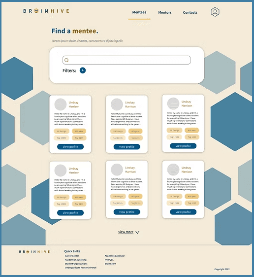
During the Fall Quarter of 2022 at UCLA, I worked in a team of eight designers, frontend, and backend software engineers to create a website through UCLA Creative Labs. As UCLA does not have a centralized peer-mentoring service/network, our mission was to create an initial version of a mentoring interface. In the platform, students can be mentors, mentees, or both. They can search for mentors or mentees based on certain criteria, and request the contact of a student they would like to reach out to.
Role: UX Designer Duration: October - December 2022
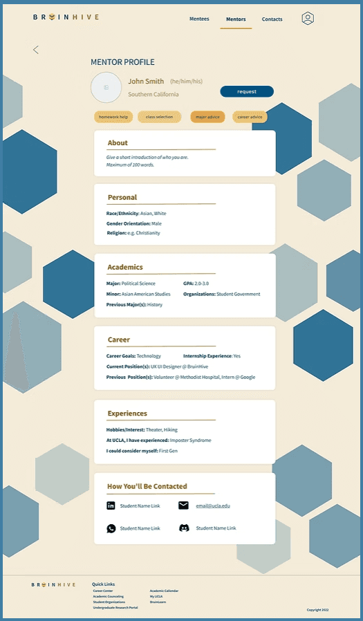
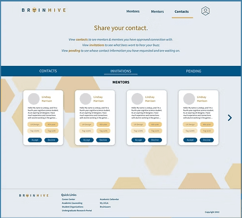
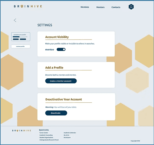
final product
starting the design process
case studies
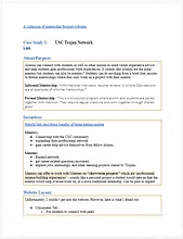
To better understand the standard for mentoring websites, our team studied the layout and functionality of other similar or popular online mentoring sites. Each team member reviewed at least two competitors. I reviewed USC's Trojan Network, MentorCruise, and 100Mentors.
Findings
We found that many mentoring sites for universities focus on career opportunities and networking. Most websites have a navigation system where you can filter mentors based on certain standards or needs.
survey
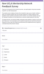
To better understand our users' needs, our team created a survey and sent it to UCLA students. The survey was used to gage their previous experience with mentoring services and platforms, how they might use our platform, and the challenges they face as a student at UCLA.
Findings
We learned that students mostly struggled with gaining positions related to their career interests or learning particular subject matter. Additionally, students would mostly use our platform as a networking opportunity.
starting the design process
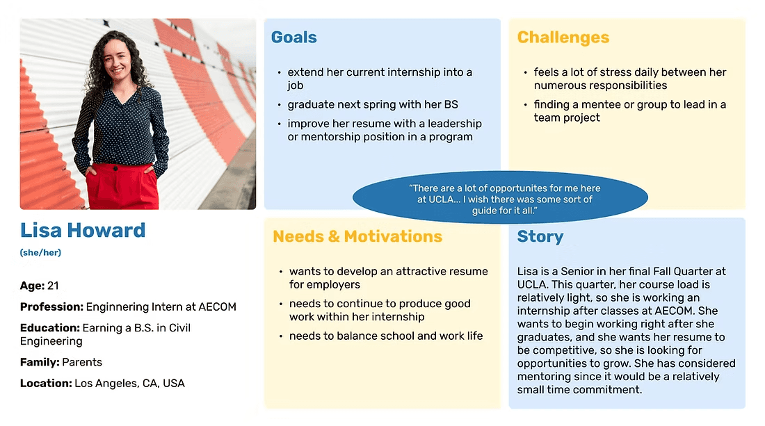
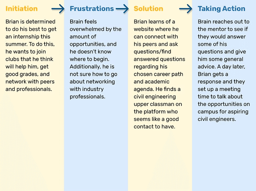
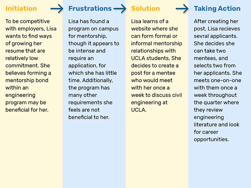
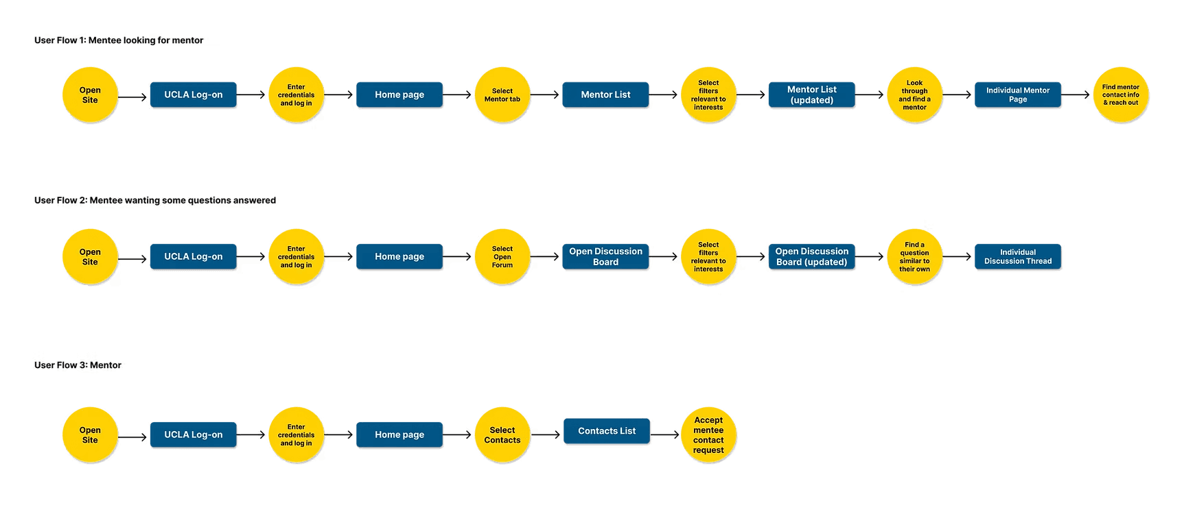
After conducting research on mentoring websites and becoming more familiar with our users' needs, we defined our users through UX storytelling. I created the following user personas and user journey maps to define our two main user groups: mentors and mentees. In addition, I created a user flow diagram to help define platform navigation for both mentor and mentee users.
personas & user journey maps
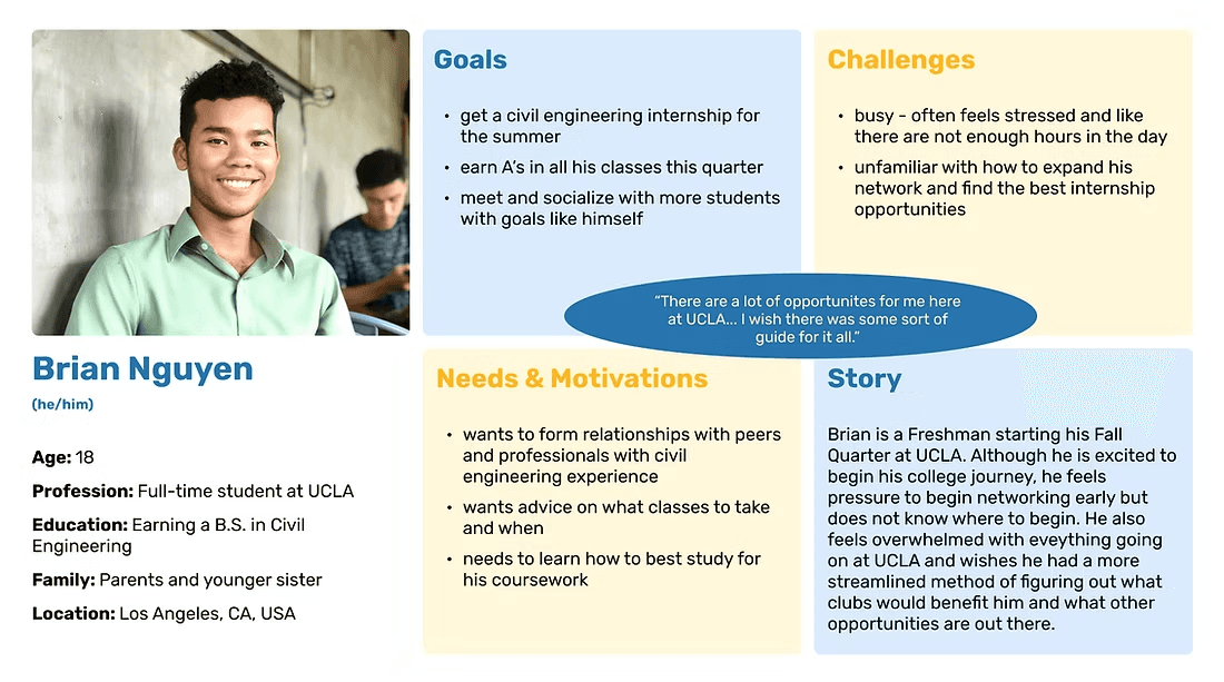
Brian's journey map
Lisa's journey map
user flow diagrams
personas & user journey maps
from paper...
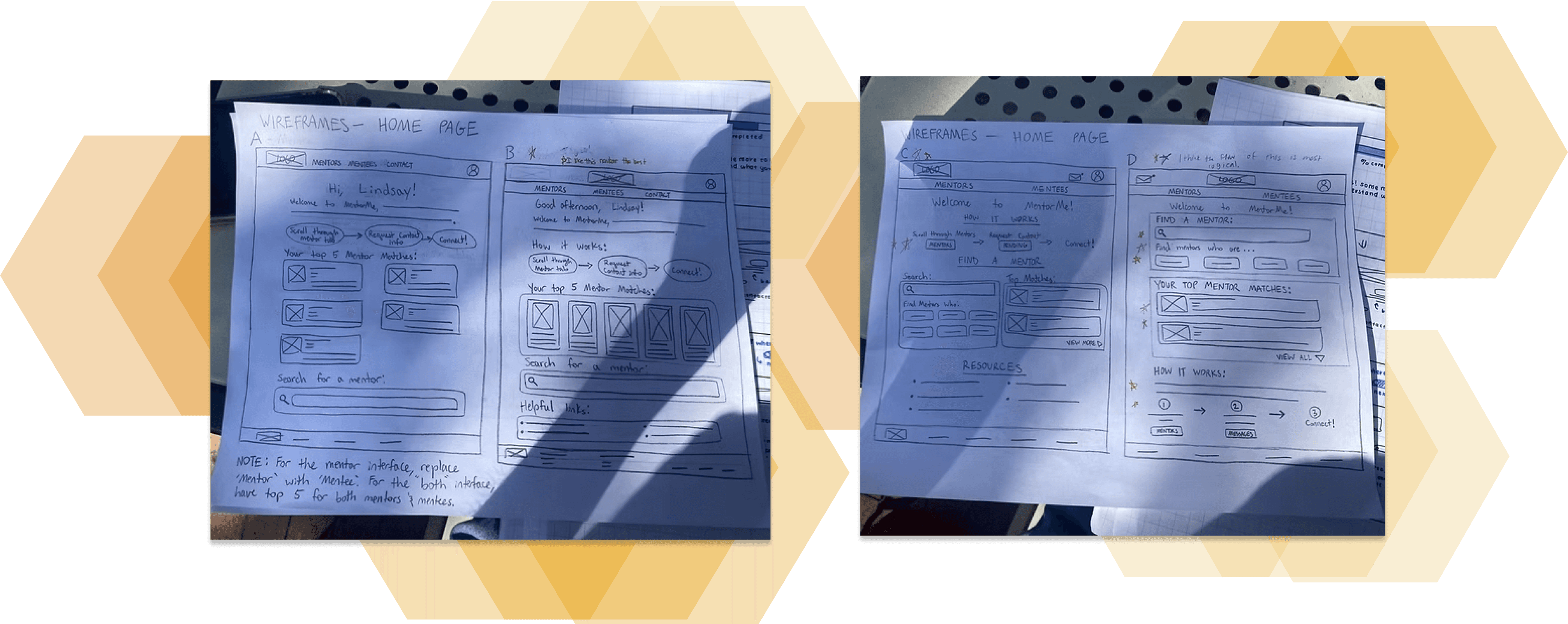
...to digital
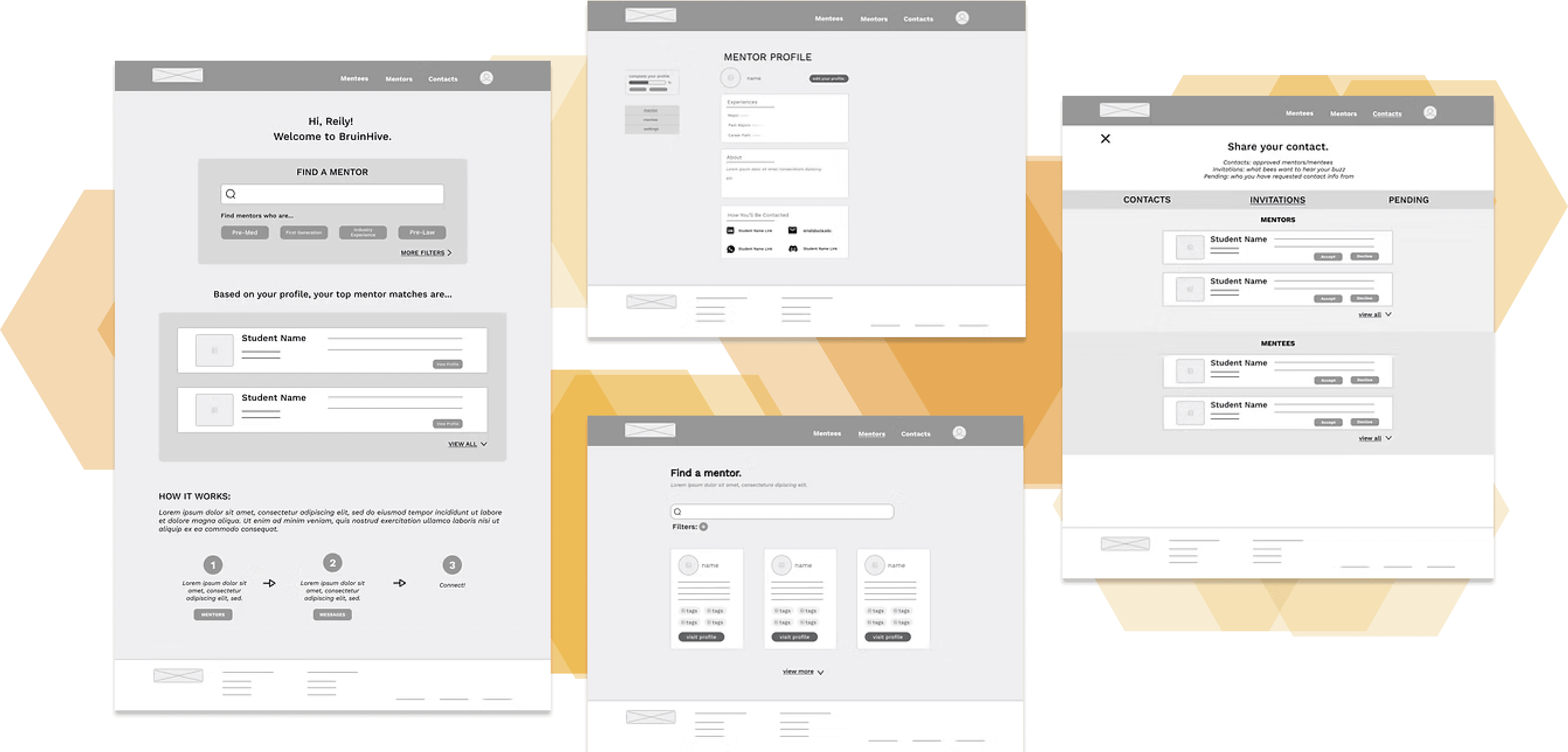
To begin our design solution, my design partner and I came up with several layout ideas for each page on paper wireframes. From there, we presented our ideas to the entire team and discussed elements of each page they each preferred. After taking their input into account, we decided on a final layout for each page, and translated those to digital wireframes using Figma.
low fidelity prototype
After designing the digital wireframes, we created a low fidelity prototype using them. The prototype would allow a user to do the following tasks:
Create a mentor or mentee profile
View their profile and edit their account settings to a limited extent
Search for mentees/mentors and request contact information
Review their contact requests and accept or decline requests from others
usability testing
At this stage, we had to determine how user-friendly our design was along with how well our design fit user needs. To do this, we conducted unmoderated usability tests. Two Google Forms were created - one for mentor users and one for mentee users. The form would walk users through tasks similar to those outlined above and prompt users for feedback on how well each task went, their overall impressions of the website, and any potential issues or concerns they might have.
findings
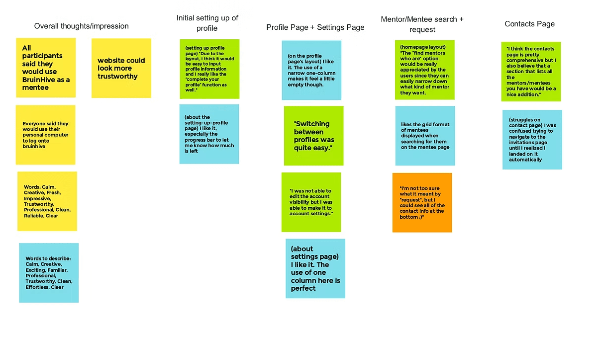
We had two participants take the mentee usability test and two take the mentor version. We then reviewed their responses and constructed an affinity diagram where we organized the notable responses based on what page was most relevant to the task they were commenting on. With this representation of their feedback, we determined what features to change and what elements to adjust.
Based on the feedback, the main issues that needed to be addressed were:
(1) the empty feel of some pages
(2) navigating the contacts page is slightly confusing
(3) the confusing options on and navigation to the settings page
design problem
the empty feel of some pages
navigating the contacts page is slightly confusing
confusing options on and navigation to the settings page
our solution
enlarge most relevant items on each page
write a more descriptive header for the page & redesign individual contacts to display contact info more clearly
create personalized settings based on if the profile is set to mentor, mentee, or both
mockups
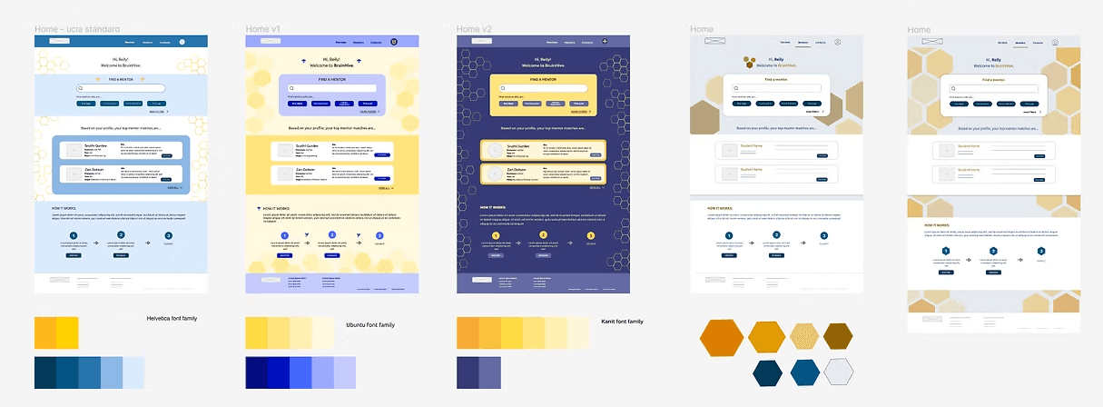
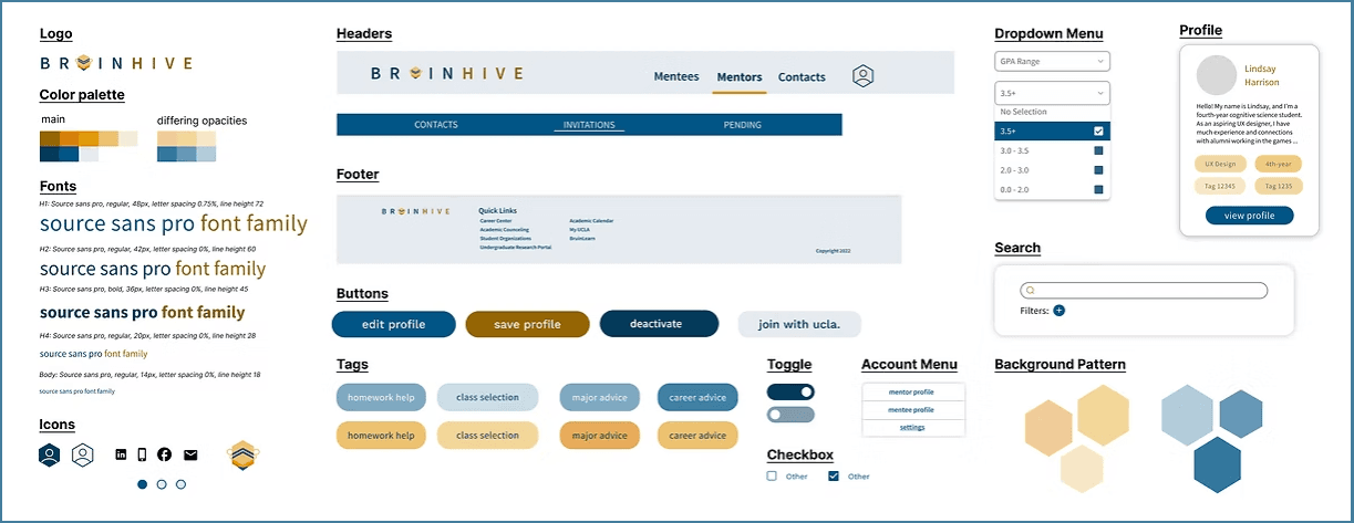
To determine our interface design, my design partner and I each came up with several different designs featuring different color schemes, font families, and decorative elements. From the above, my designs included the leftmost three, and I developed color schemes for all except the second design from the right.
Then, similar to our wireframing process, we had the entire team review each design and provide their feedback on different design elements. Following their review, we determined a final style, shown below.
style guide
accessibility
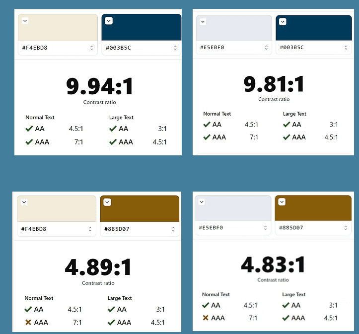
To ensure our text-background color combinations met the WCAG 2.l minimum accessibility standard, we used the Stark plugin within Figma to observe their contrast ratios. We found that all combinations at least met the AA standard ratio of 4.5 : 1 for normal texts.
In future steps within the design process, we might also consider alternative fonts, conduct tests with a screen reader, and ensure there are multiple forms of navigation within the site.
high fidelity prototype
After creating our mockups, we used them within a high fidelity prototype. Like the lo-fi prototype, the prototype would allow a user to do the following tasks:
Create a mentor or mentee profile
View their profile and edit their account settings to a limited extent
Search for mentees/mentors and request contact information
Review their contact requests and accept or decline requests from others
second usability testing
After creating our hi-fi prototype, we had to again determine how well our updated design fit user needs. We again conducted unmoderated usability tests with two google forms - one for mentor users and one for mentee users. The form would walk users through tasks and ask for feedback similar to that of the first usability study.
future steps & takeaways
As this project was meant to last the duration of UCLA's ten-week quarter, we unfortunately did not complete the second round of usability testing. Thus, the immediate steps to be performed for the project would be:
Send the usability tests to more participants and analyze participant responses
From the analysis, determine user pain points along with solutions to such pain points
Iterate on the design process
Communicate changes with the frontend team and assist with translating our design to a more finalized website
Although there would be more to complete with this project, the experience still taught me how to work closely with a research and design partner. Additionally, I learned how to work with both frontend and backend teams throughout the design process. I also gained experience pitching my ideas to the team lead, and presenting my design process at UCLA Creative Lab's Fall 2022 Demo Day.
lindsay
HArrison
(C) 2024 by Lindsay Harrison. Created with Figma & Framer.