La Historia Historical Society
Usability Testing & Website Improvements
By Lindsay Harrison with H.U.E.

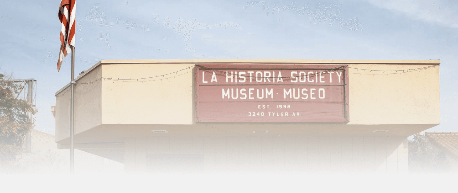
La Historia Historical Society
Re-designing the organization’s website.
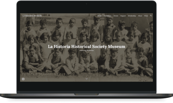
La Historia Historical Society (LHHS) Museum is a nonprofit organization established in 1998 by residents of the El Monte community. Their goal is to preserve the cultural identity and legacy of the Mexican American El Monte community. In this project, I worked in a team of three designers within Humans in User Experience (HUE) to conduct user research and update the LHHS website.
TYPE: Client Project
Duration: 6 Months
Platform: Web & Mobile
Role: Team UX Researcher
PRODUCT: Non-Profit Online Donation

Challenge
Design an interface for community members with low technology proficiency who want to donate.

Stakeholders
La Historia Historical Society members
El Monte community
HUE Team Lead
Metrics for Success
System Usability Scale
Task Completion
Time on Task
Satisfaction

Initial Solution
Make the artifact donation process streamlined and accessible by reducing the steps needed.

Updated Solution
Write clearer copy and update site navigation by linking pages directly in page content.
PROBLEM
Users struggle to use the website's volunteer and donation forms - many just call or email staff members instead.
Final Prototype
Project Impact
1. Revised system of collecting material donations, monetary donations, and volunteers via Google Site.
2. Improved writing throughout site for clearer instruction regarding site functionality.
3. Increased LHHS team's technological fluency to navigate Google Suite and collect responses via Google Sites.
Deliverables
1. Detailed written report on user needs, Usability Test results, and website recommendations.
2. Updated website with more welcoming language, detailed instruction, and flexible navigation.
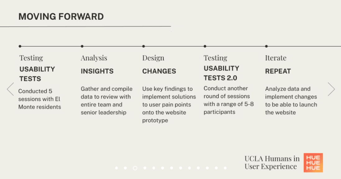
PROCESS
Review Research
Consult user interviews and personas from the designers of the current website prototype.
Usability Testing
Test the website to understand potential sources of confusion among community members.
Stakeholder Meeting
Report findings from our initial usability testing and assess stakeholder needs.
Further Testing & Analysis
Investigate why specific navigation elements or tasks pose problems.
Web Design Updates
Implement website changes based upon user feedback. Consolidate research findings into a report.
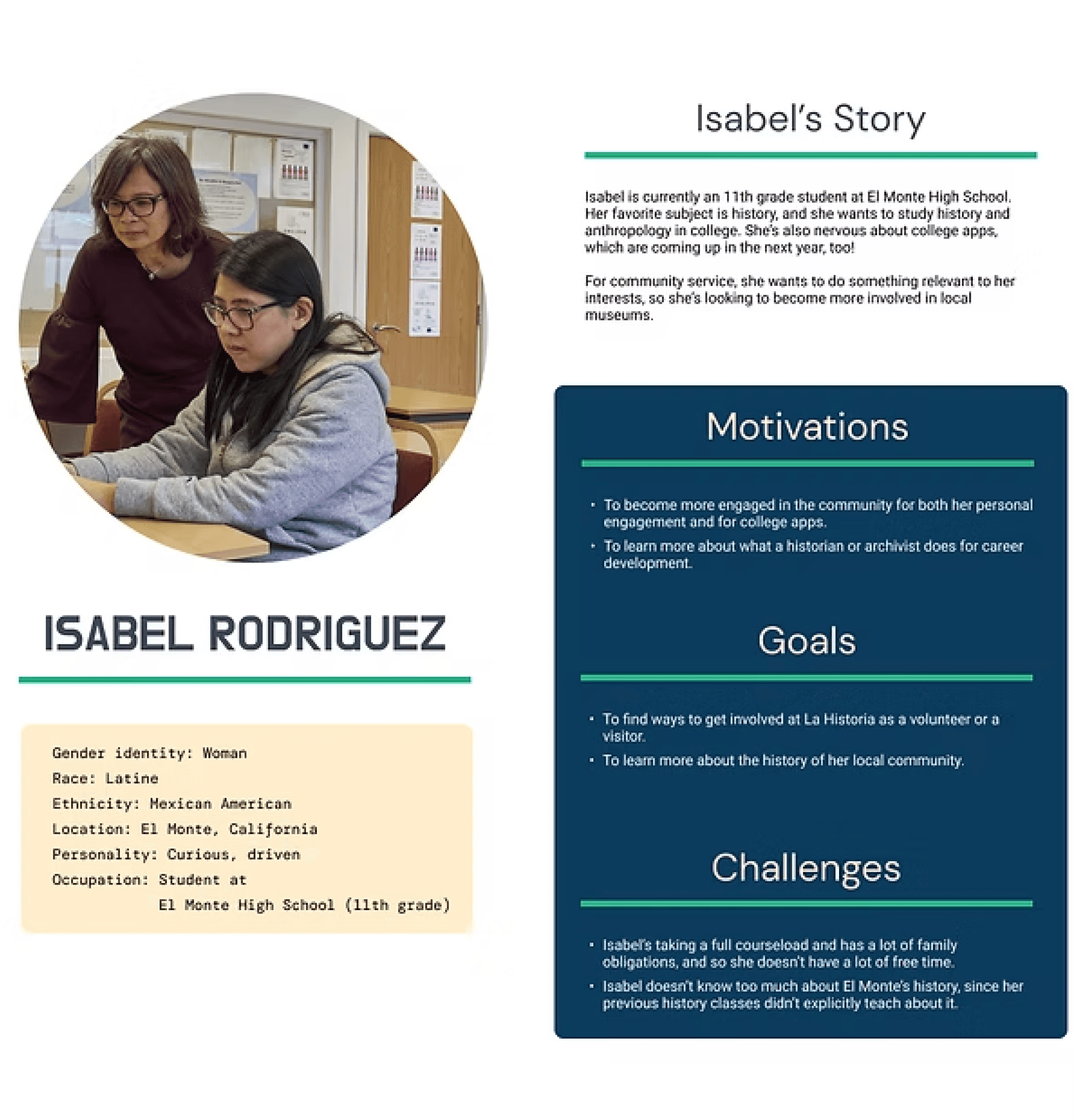
One of our user personas created by team lead James Yoon.
Reviewing Past Research
GOAL: Understand the reasoning behind the current design. Get acquainted with the problem space.
I reviewed data from user interviews and personas from the designers of the current website prototype. Additionally, the team had a meeting to discuss the current prototype and research goals.
Key Questions Asked:
Who are the target users for the LHHS website?
How do users currently go about donating and volunteering?
What are the research objectives of usability testing?
Takeaways:
Target users include: current El Monte residents, older folks from El Monte, and local students.
Usability Testing research objectives include: identifying user pain points and qualifying user behavior and user flow.
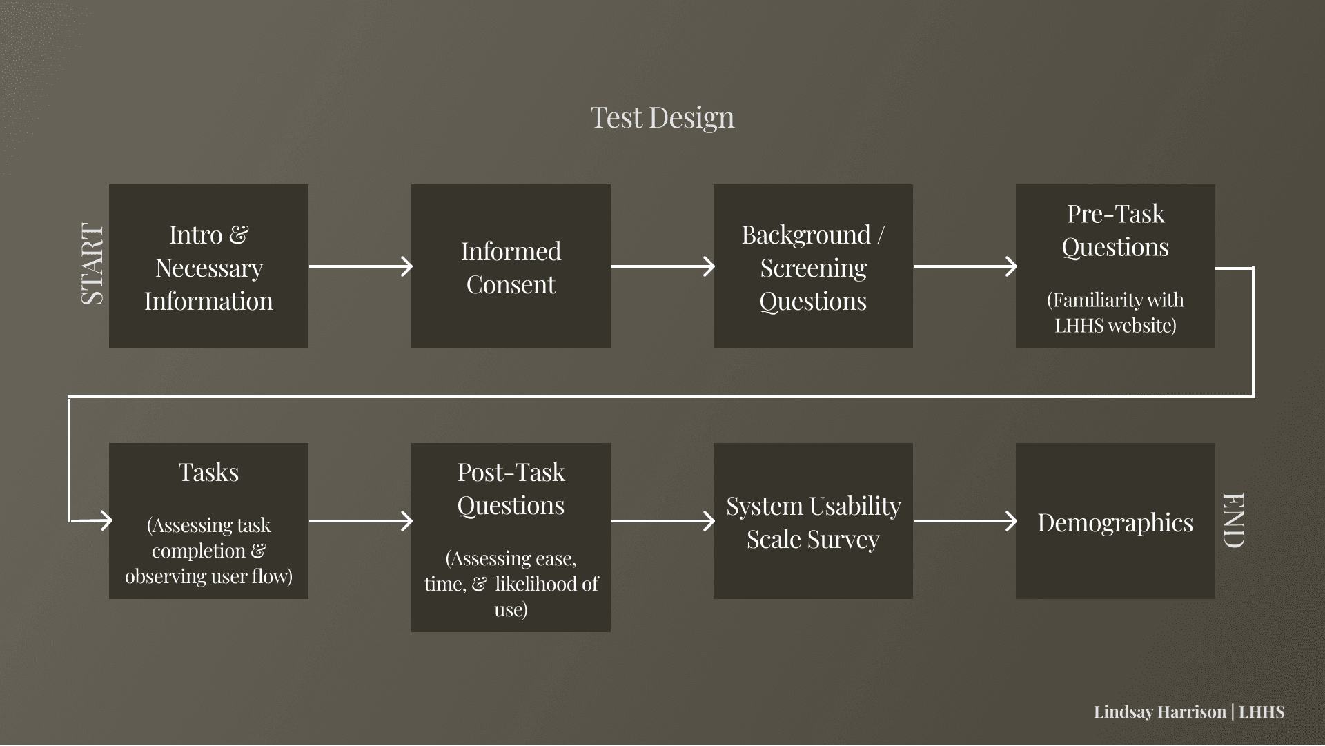
The Site Should Allow Users To...

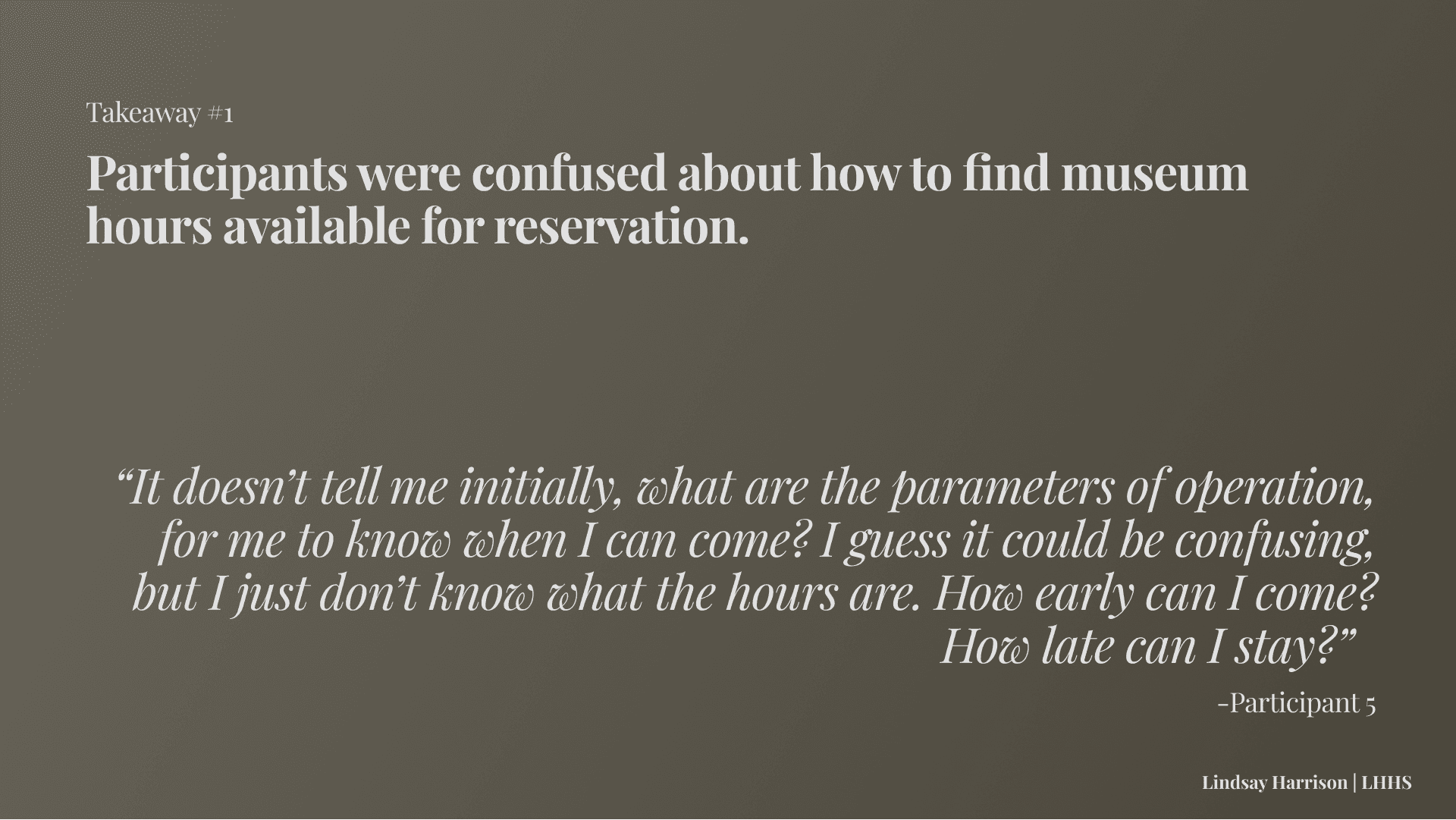
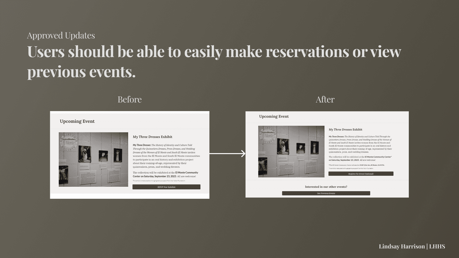
Make a Reservation to Visit.

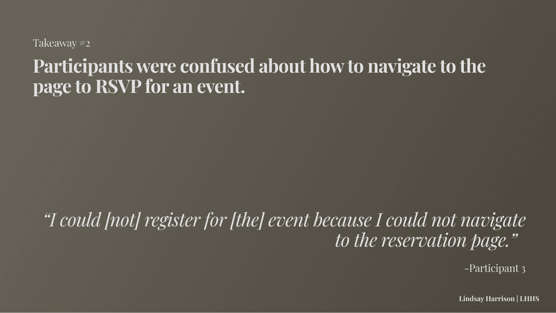
Find Event Details & RSVP.

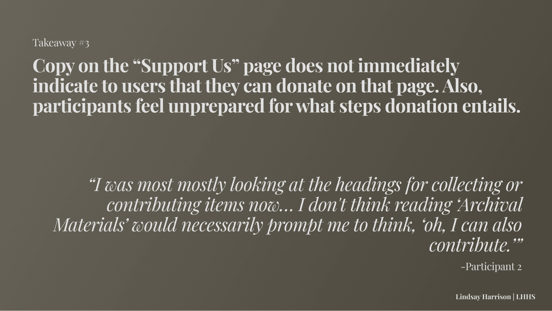
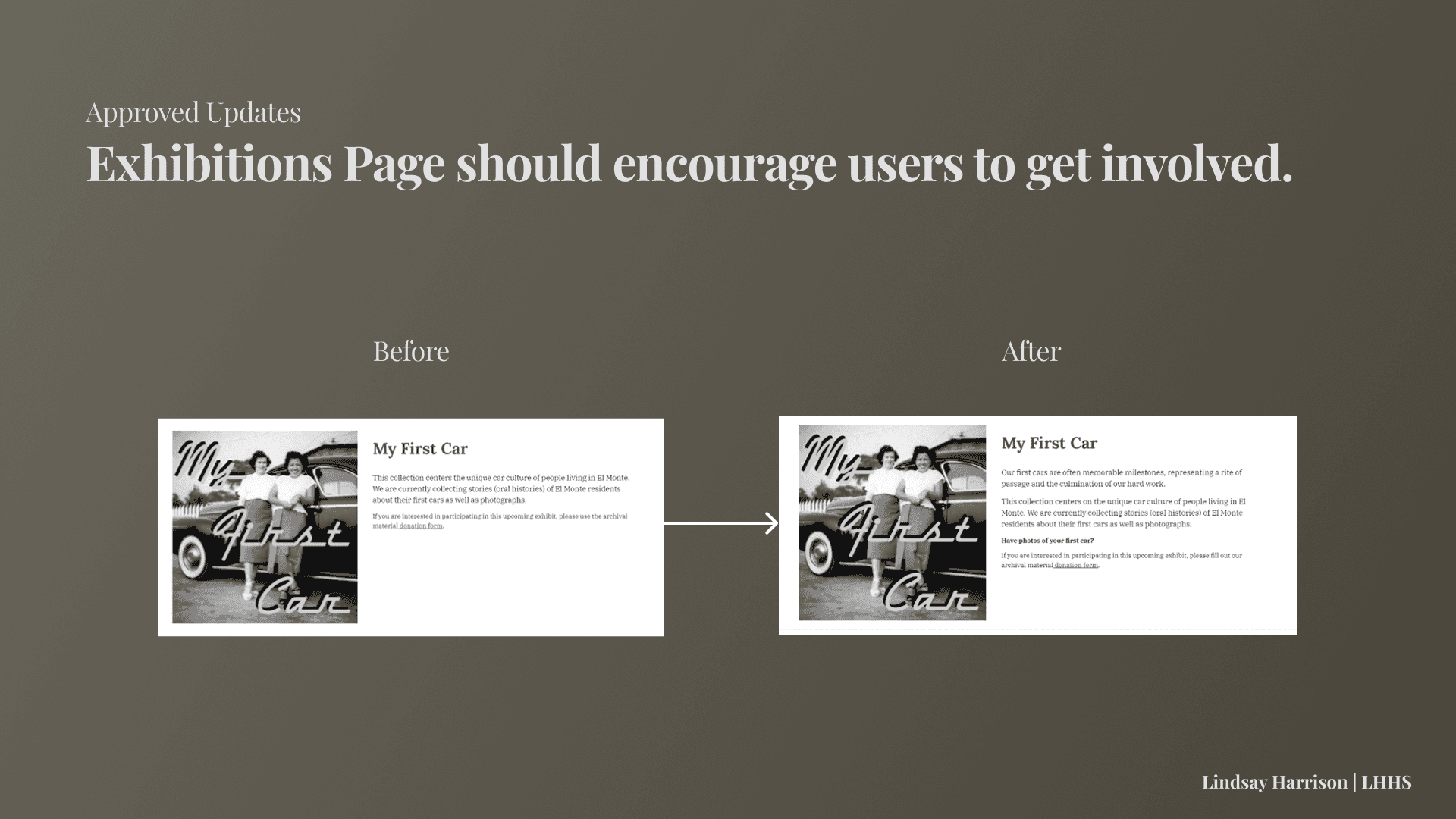
Donate a Photo to the Collection.

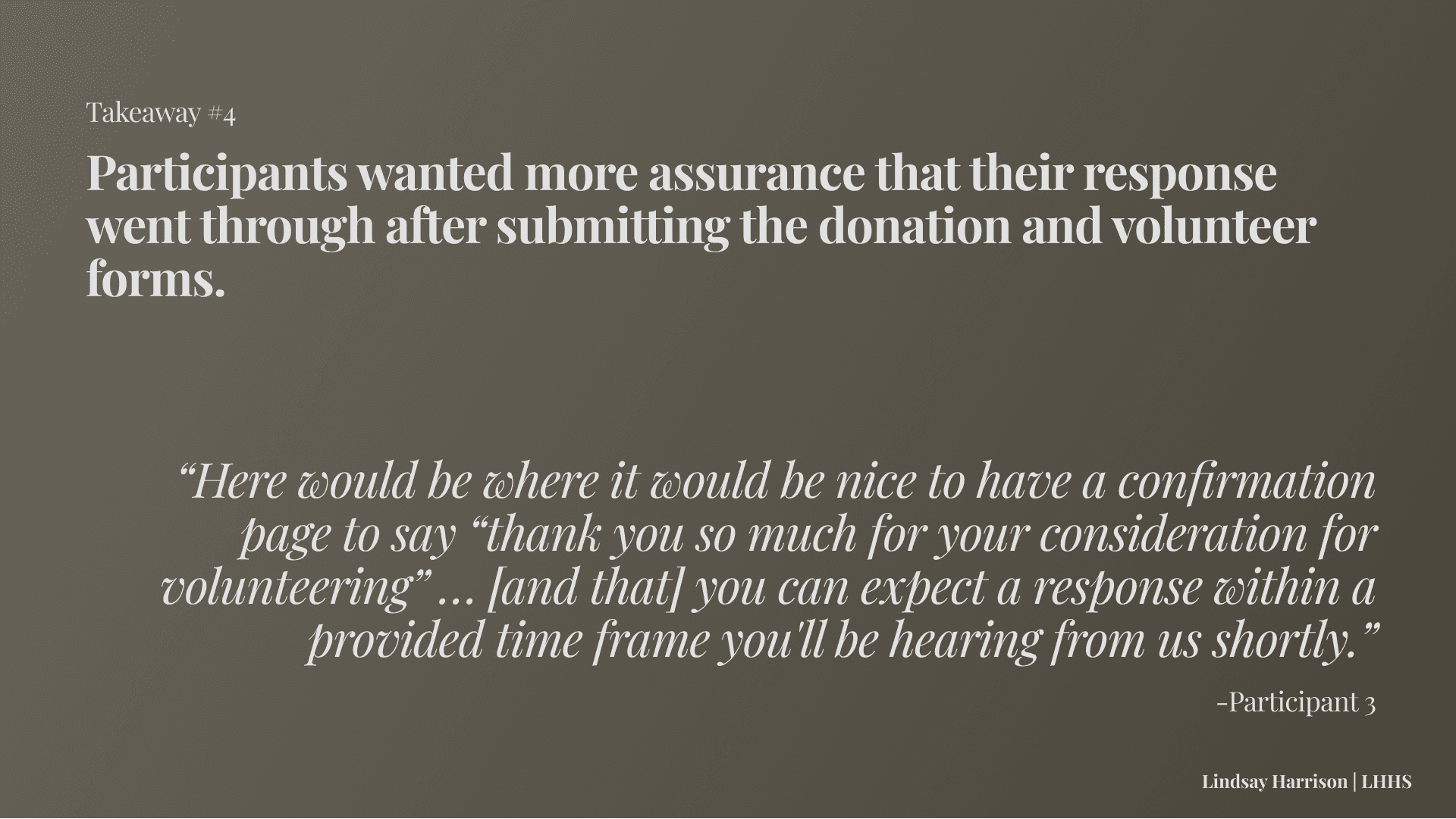
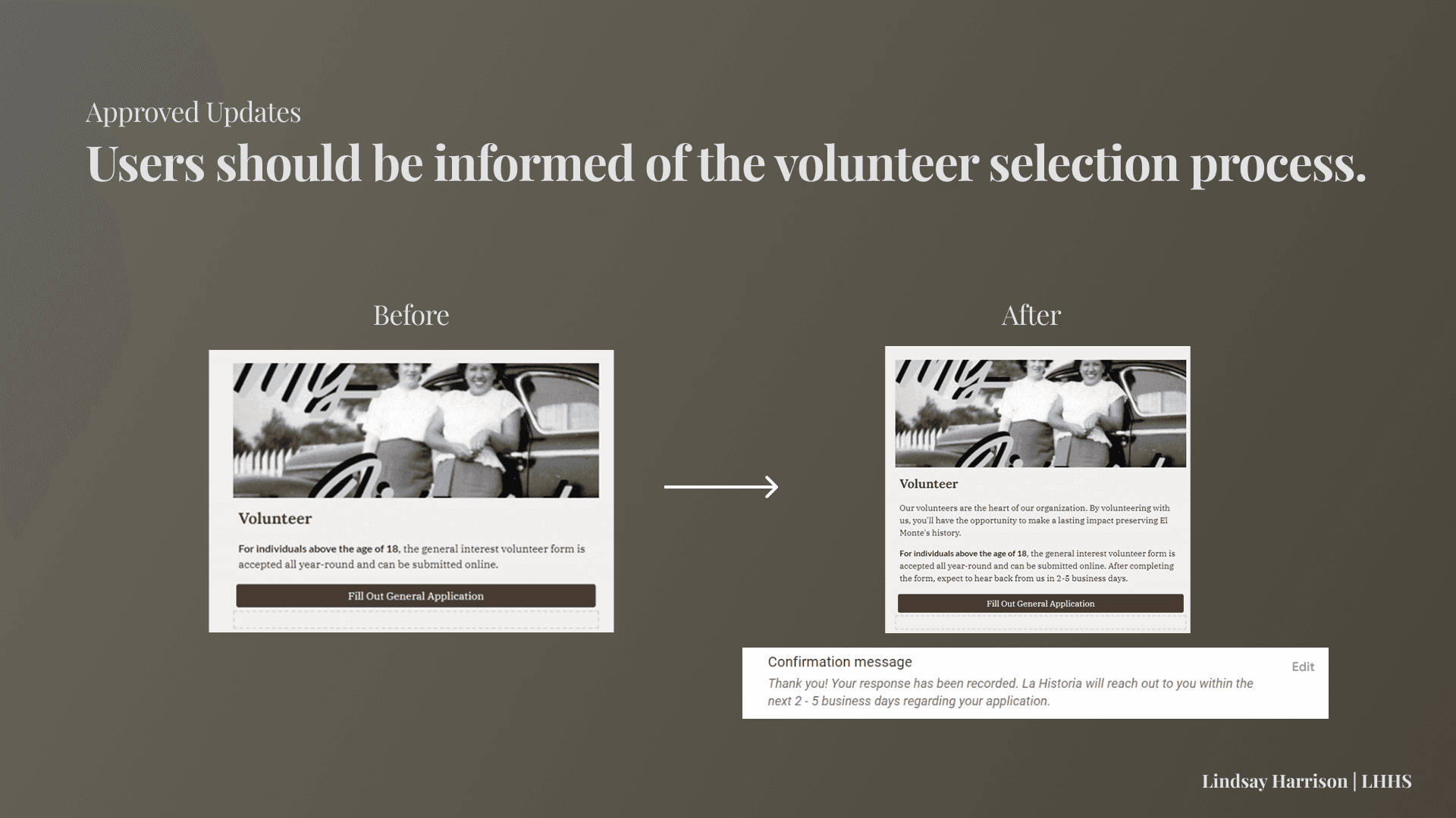
Sign Up to Be a Volunteer.
So participants will be asked to complete each of these tasks.
And we want to test site functions’...

Ease of Use.
Time to Complete.
Likelihood of Use.
So participants will be asked post-task questions assessing these variables.
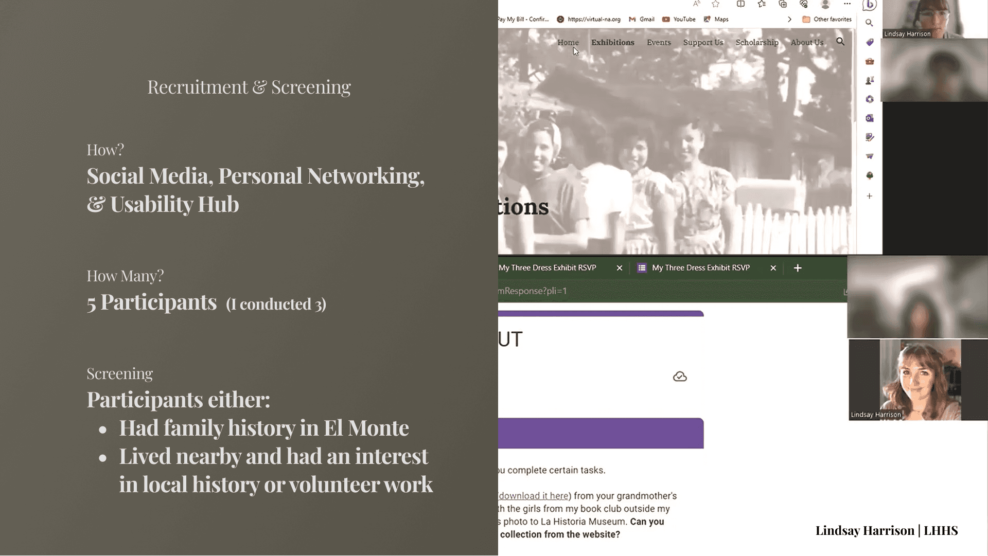
Usability Testing I
GOAL: Learn how well the current website connects the public to LHHS and serve user needs.
Number OF Interviewees: 5 (3 conducted by myself)
Had a mix of older El Monte residents and students who have volunteered in L.A. County complete tasks within the current website.
Test Design & Takeaways:
Stakeholder Presentation
GOAL: Discuss current findings & gain insight, direction, and feedback from members of LHHS.
After the first round of usability testing, we met with La Historia staff members to discuss our initial findings and suggested website changes.
Additionally, the members of La Historia reviewed the website prototype in detail and expressed the following needs:
Admin Use: They discussed wanting more streamlined functionality on the website for museum staff and volunteers.
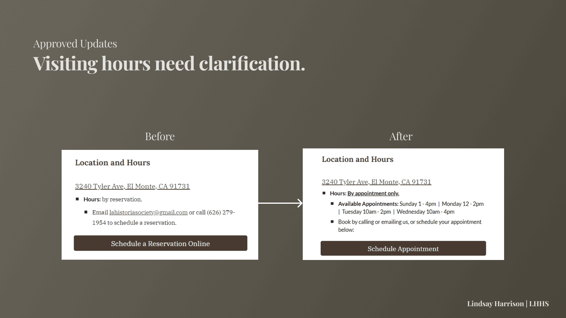
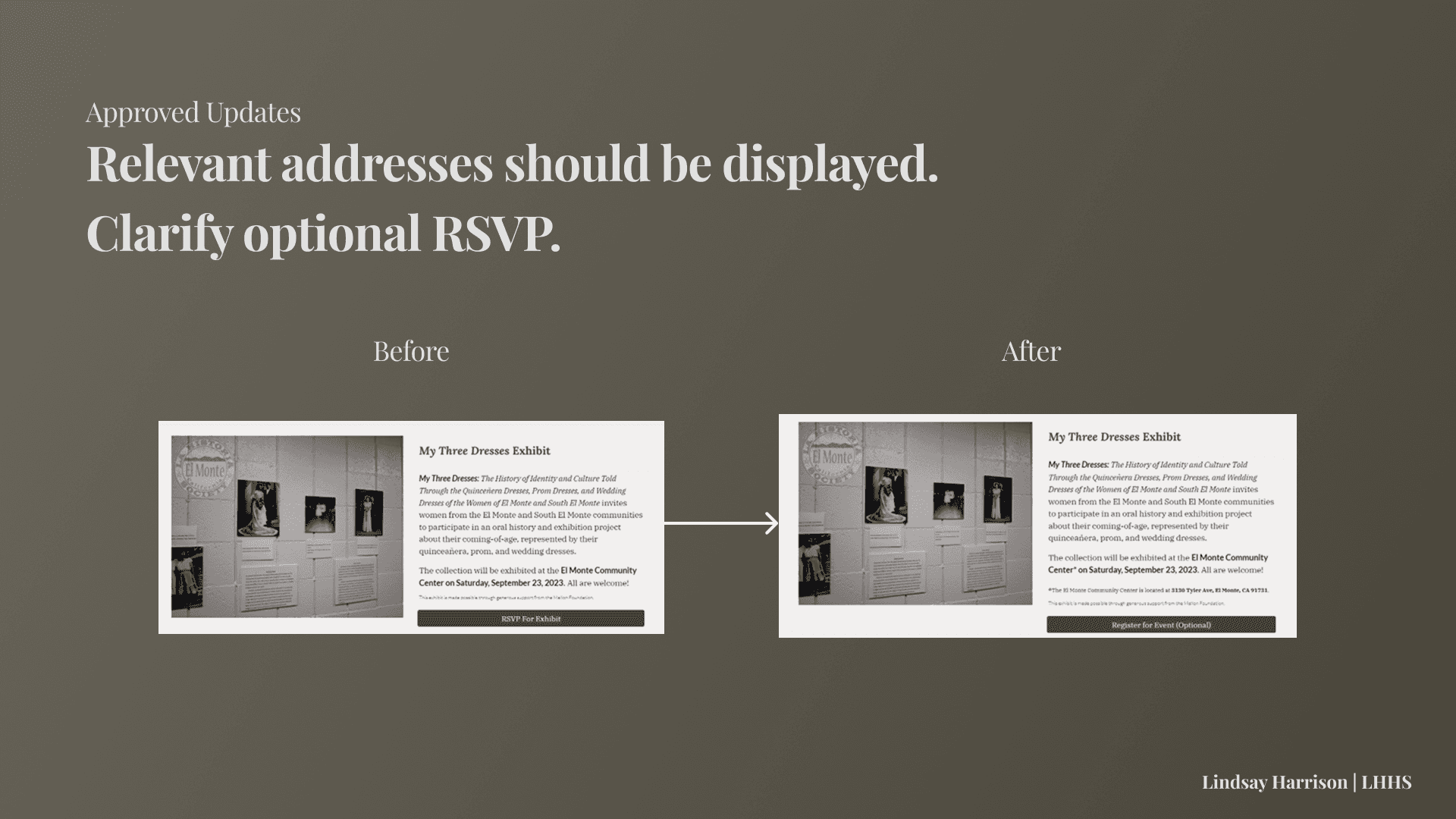
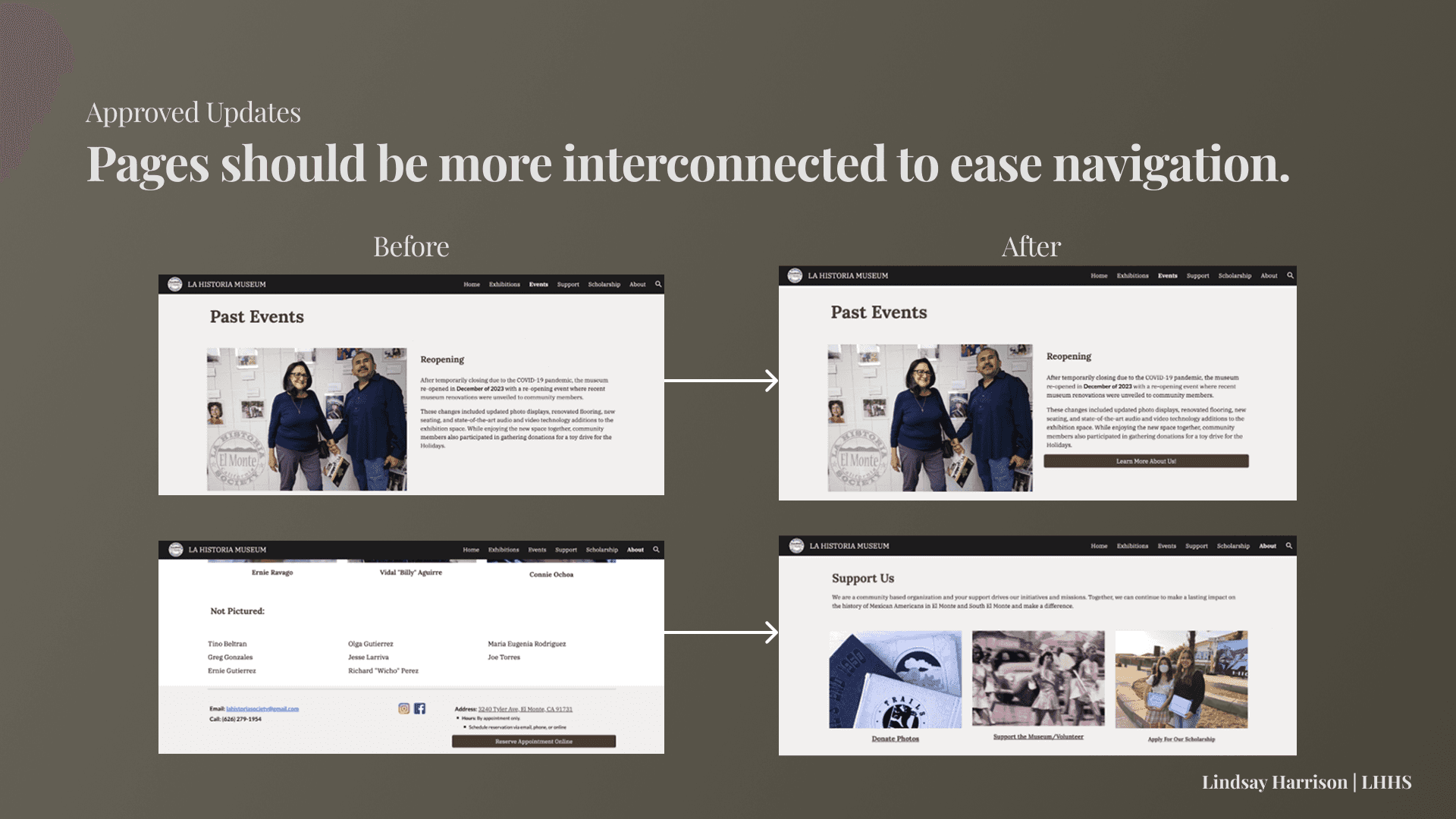
Task 2 - Address visibility: El Monte Community Center Address should be on the website since they reasoned many people using the website may be less familiar with El Monte in the first place.
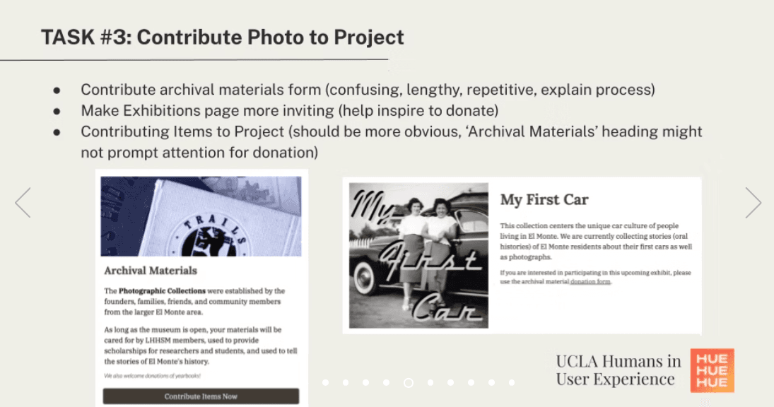
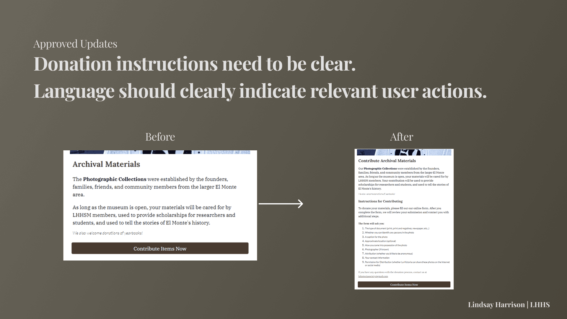
Task 3 - Make artifact donations more streamlined & accessible: Staff expressed they thought the form should be more accessible from the website, perhaps by being present on the Home Page.
Task 3 - More instruction needed: Stakeholders highlighted what is an acceptable donation and what is not should also be made clear on the website.
Usability Testing II
GOAL: Continue learning how well the current website connects the public to LHHS.
Number OF Interviewees: 5 (again, 3 conducted by myself)
We decided to conduct another round of usability testing to focus on sources of user confusion especially surrounding Task 3, the donation of museum materials, since it was the most difficult task for users to complete.
Our findings reaffirmed those from the first round, but allowed us to highlight two central issues throughout the site:
Key Takeaways:
Lack of detailed instruction and call-to-action
Need for more flexible website navigation
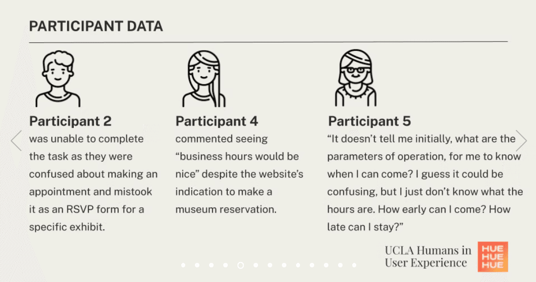
User Quotes:
"I think I’d like to see a page where I click on [the exhibit] and take me to a separate page, where a little bit more in depth."
-Participant 6
"Maybe just take off registration and just RSVP, because registration is more formally known as 'I'm going to be a speaker' or 'This is an event that I need to purchase tickets for'."
-Participant 7
"I thought you'd be able to, one, click on something here [on the home page] to take me to the events to make it faster."
-Participant 9
Holistic Findings
PARTICIPANT DEMOGRAPHICS
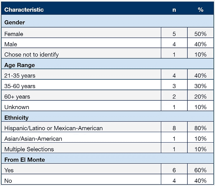
Of the ten participants, four identified as male and five identified as female. Participants’ ages ranged from 21 to 66 (X = 33.67, s = 16.40). Eight participants reported being ethnically Hispanic or Mexican-American, one reported being Asian-American, and one reported being mixed race (Mo = Hispanic/Latino). Additionally, six out of the ten participants were from El Monte and the other four were from other locations across Southern California. Participants unaffiliated with LHHS were compensated with $10.
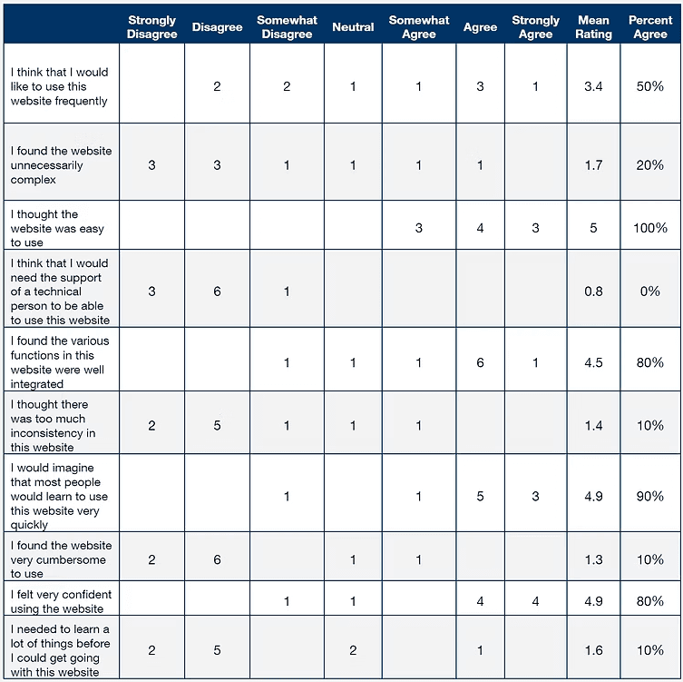
*Percent Agree (%) = Somewhat Agree, Agree & Strongly Agree Responses combined
Post-Task SUS Questionnaire
After task session completion, participants rated the site with a System Usability Scale (SUS) to measure overall satisfaction. The SUS score based on the ratings reveals 76.5 out of 100. This implies that the experience of the website is relatively satisfactory as overall SUS score over 60 is considered the standard.
SUMMARY OF DATA
The data shows an overall high task completion rate but the satisfaction ratings reveal not much significant level of positive experience. Of the tasks, Task 3 appears to be the most difficult to complete, and the most time-consuming (Time on Task measured in seconds).
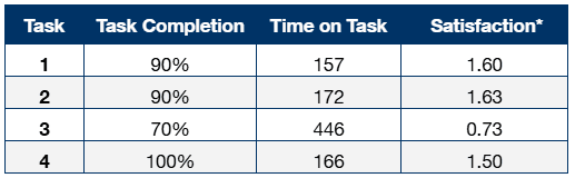
* Satisfaction = Mean combined rating across three post-task measures: perceived ease of use, efficiency, and likelihood of completing the task outside a testing environment. 3 for highly satisfactory, 0 for unsatisfactory, and -3 for highly dissatisfactory.
** Time on Task is measured in seconds
Suggested Updates
We had discovered the two major issues with the website prototype were (1) Site Writing and (2) Site Navigation. Based upon these general themes, we reviewed participant transcripts and stakeholder needs and identified specific changes needed.
Terminology & Instruction Changes Summary
Across all tasks, slight language and presentation changes could significantly improve site clarity and functionality.
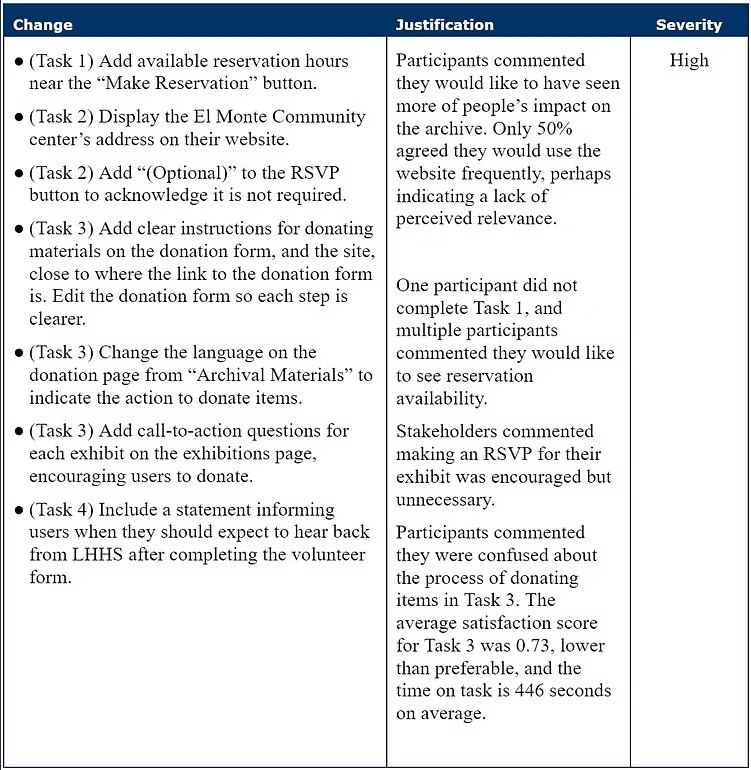
Examples of Changes:
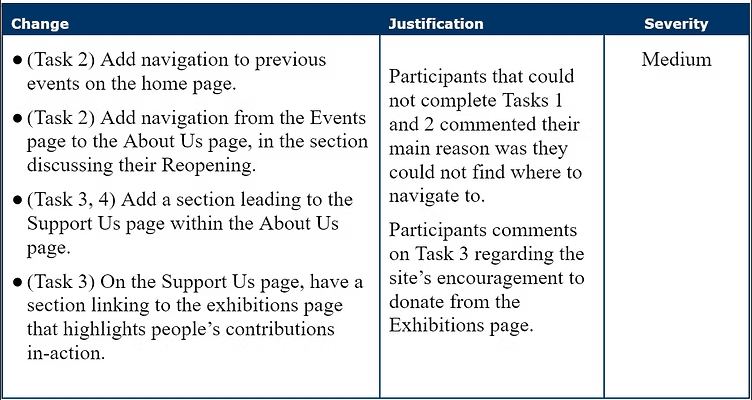
Navigation Changes Summary
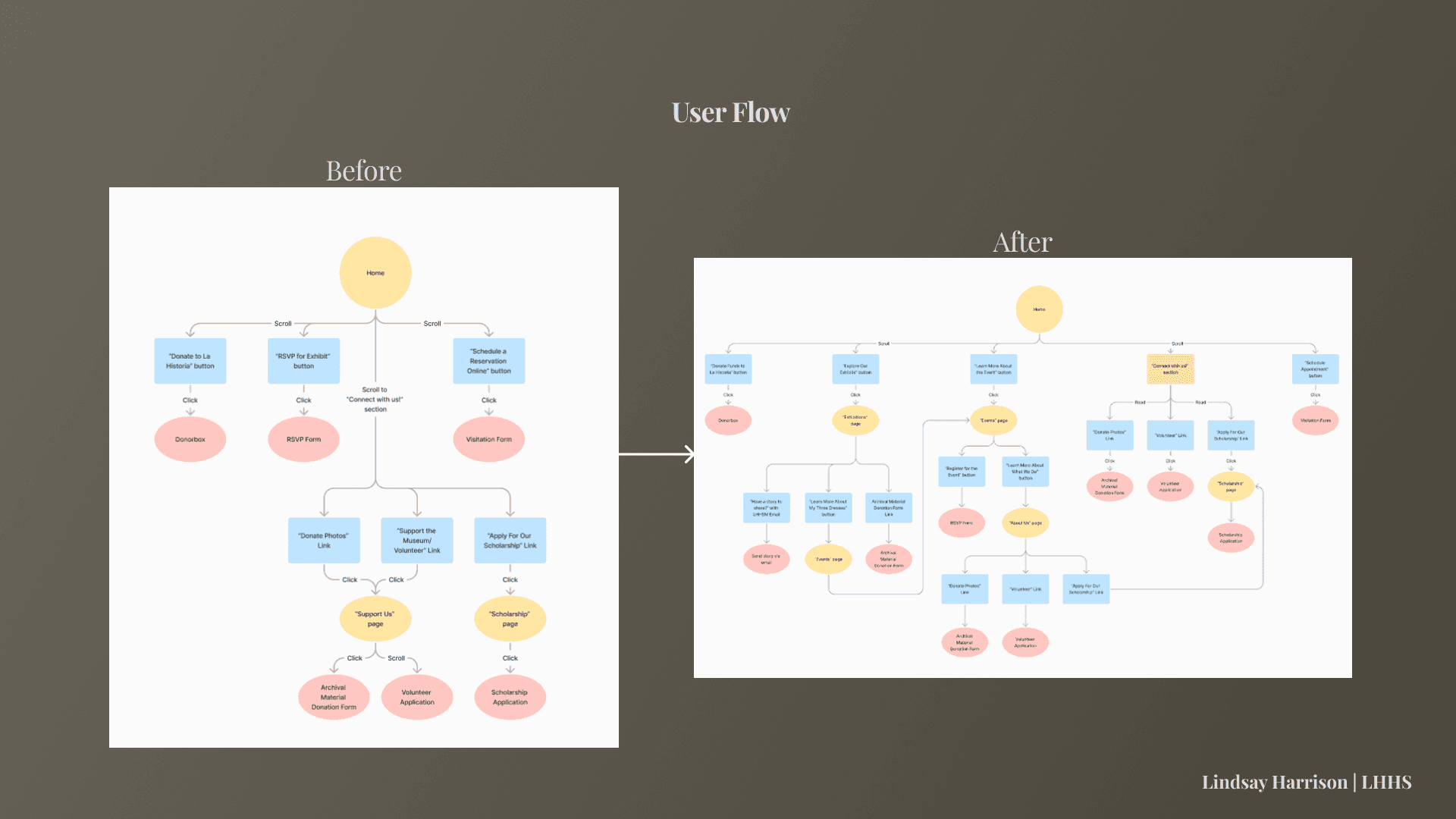
Usability could be improved in Tasks 2 and 3 by including more within-page navigability instead of relying on use of the navigation bar. In general, expanding upon how users can navigate through the site provides more methods to effectively use the site.
Examples of Changes:
View a more in-depth description of website changes in our Usability Test Report:
Key Project Takeaways
More Paths Allow for More Users: Different users will make different associations and thus take different paths to accomplish goals.
Writing Makes a Difference: Copy keys users in to what they are able to accomplish, and sometimes more detail is better.
Listen - Let Users Do the Talking: This project helped me learn how to conduct usability tests.
lindsay
HArrison
(C) 2024 by Lindsay Harrison. Created with Figma & Framer.